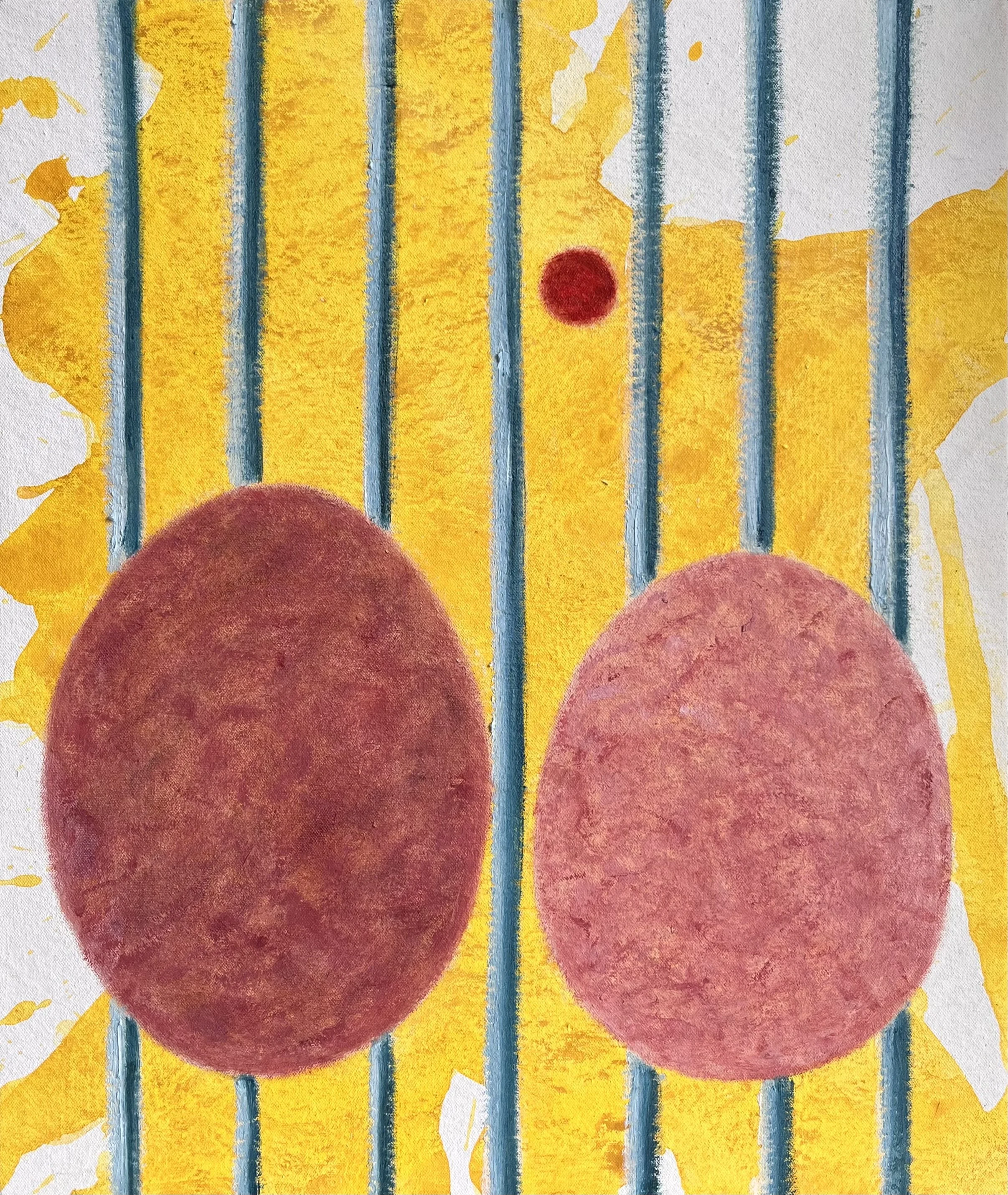
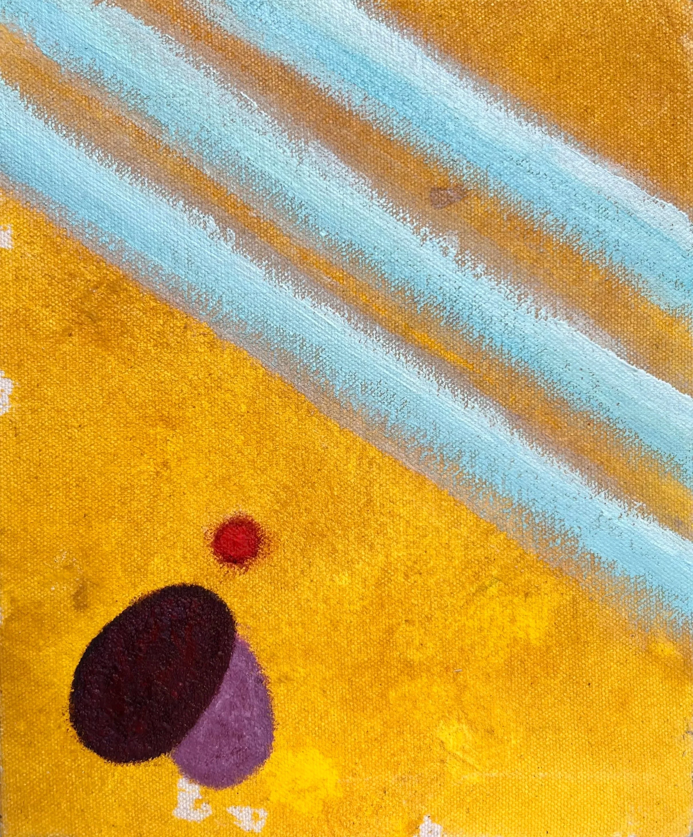
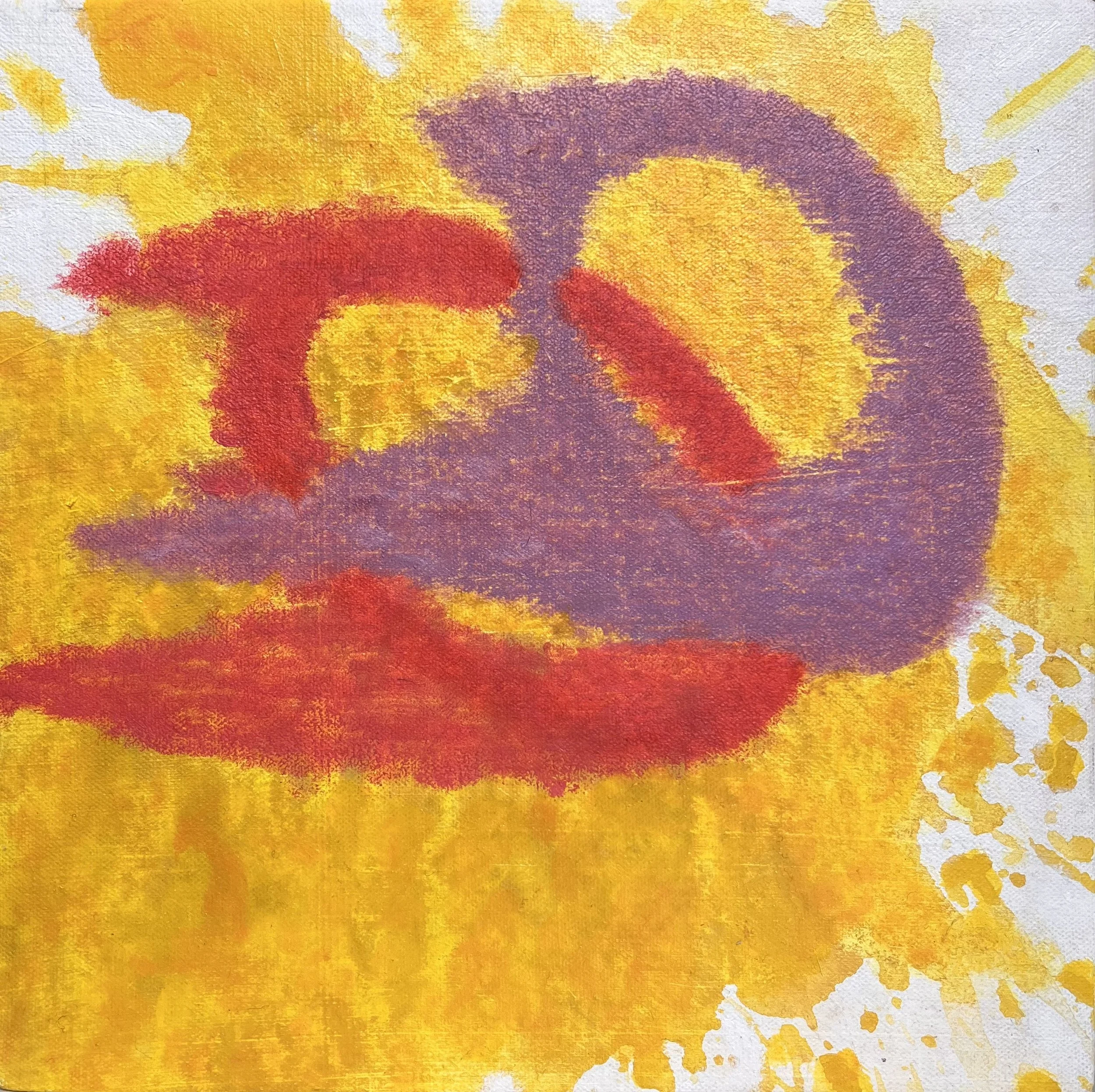
YOLKO series
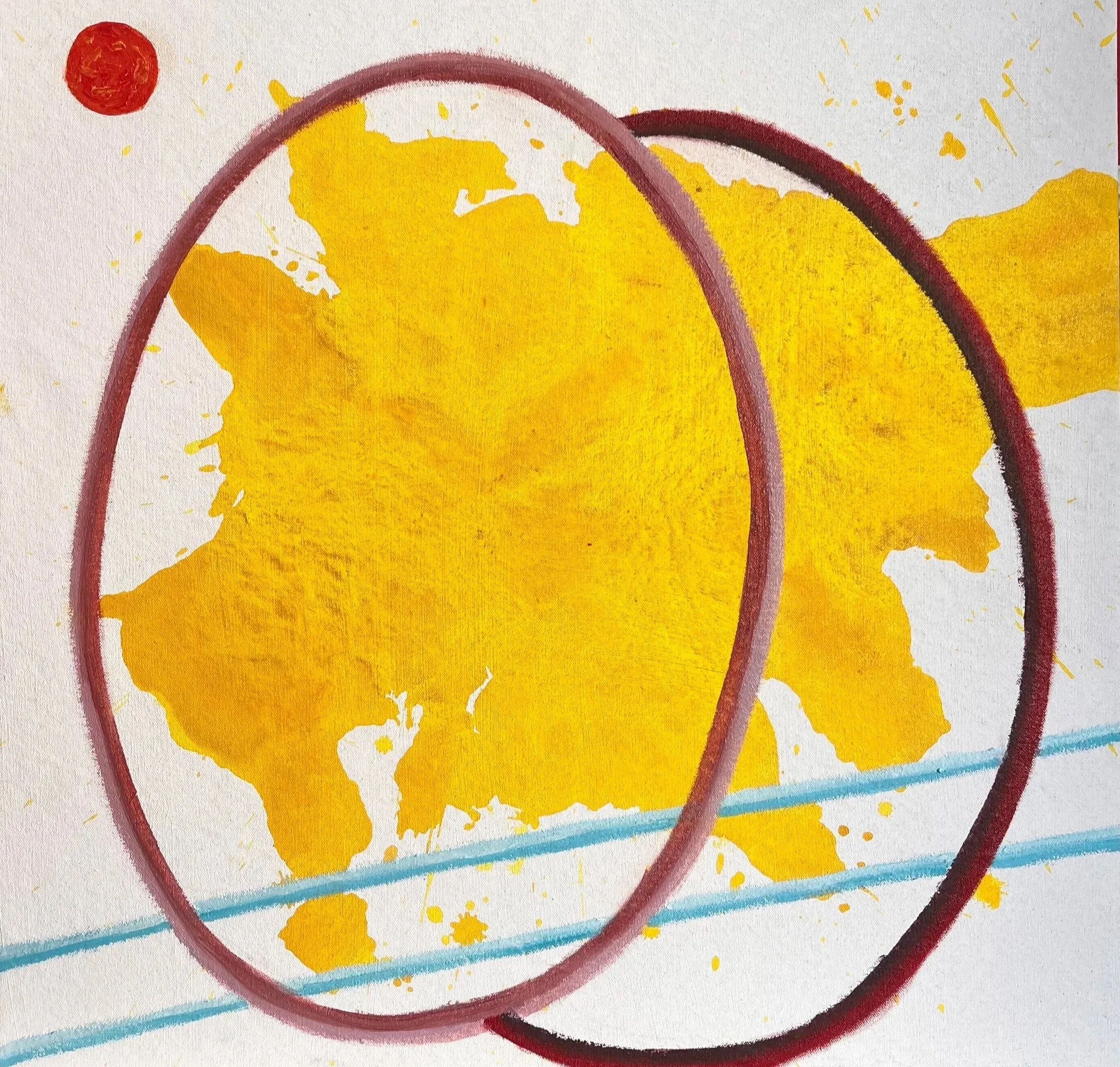
YOLKO 21 (2025)
Acrylic on unprimed canvas
55 x 55 cm
The YOLKO series functions as an autoethnographic critique of consumer aesthetics. Drawing on a two-decade career in consumer marketing and global brand direction across luxury fashion and media, the work serves as an act of visual reverse-engineering. It deconstructs the polished veneers of corporate persuasion to examine the underlying mechanisms of commercial branding.
By appropriating the saturated colours of supermarket packaging, the paintings explore the distance between natural origins and industrial confinement. The title itself merges the organic ‘yolk’ with the synthetic naming conventions of processed foods (echoing brands like JELLO), while the ‘O’ also references the recurring circular motifs found throughout the broader practice. Utilising a flat, unshaded aesthetic, the work operates as a mute sign. It avoids didactic narratives, instead holding systemic critique in direct balance with the visual seduction of commercial design.
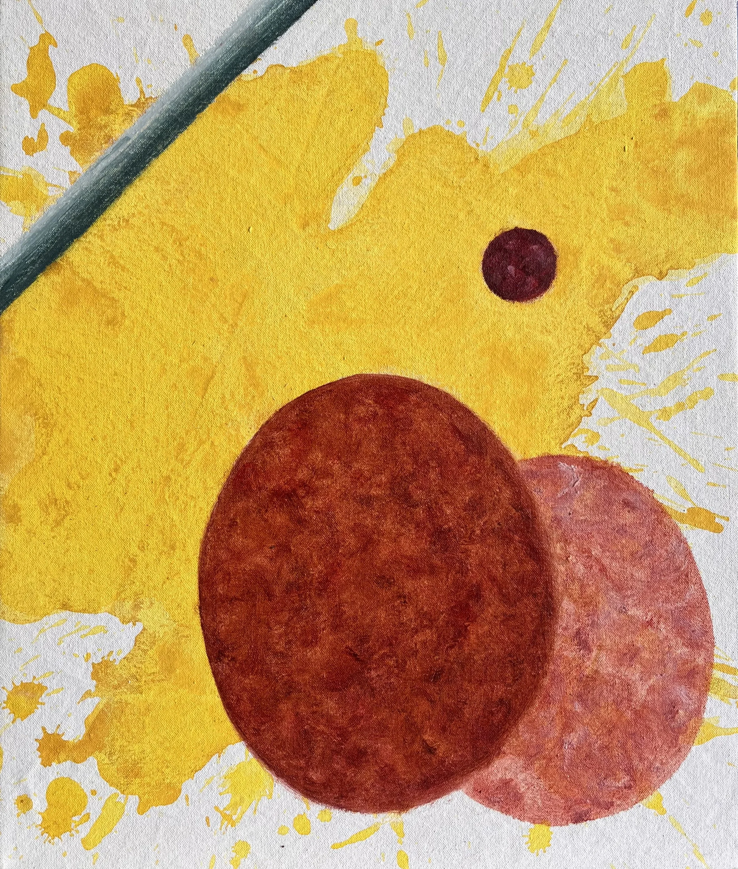
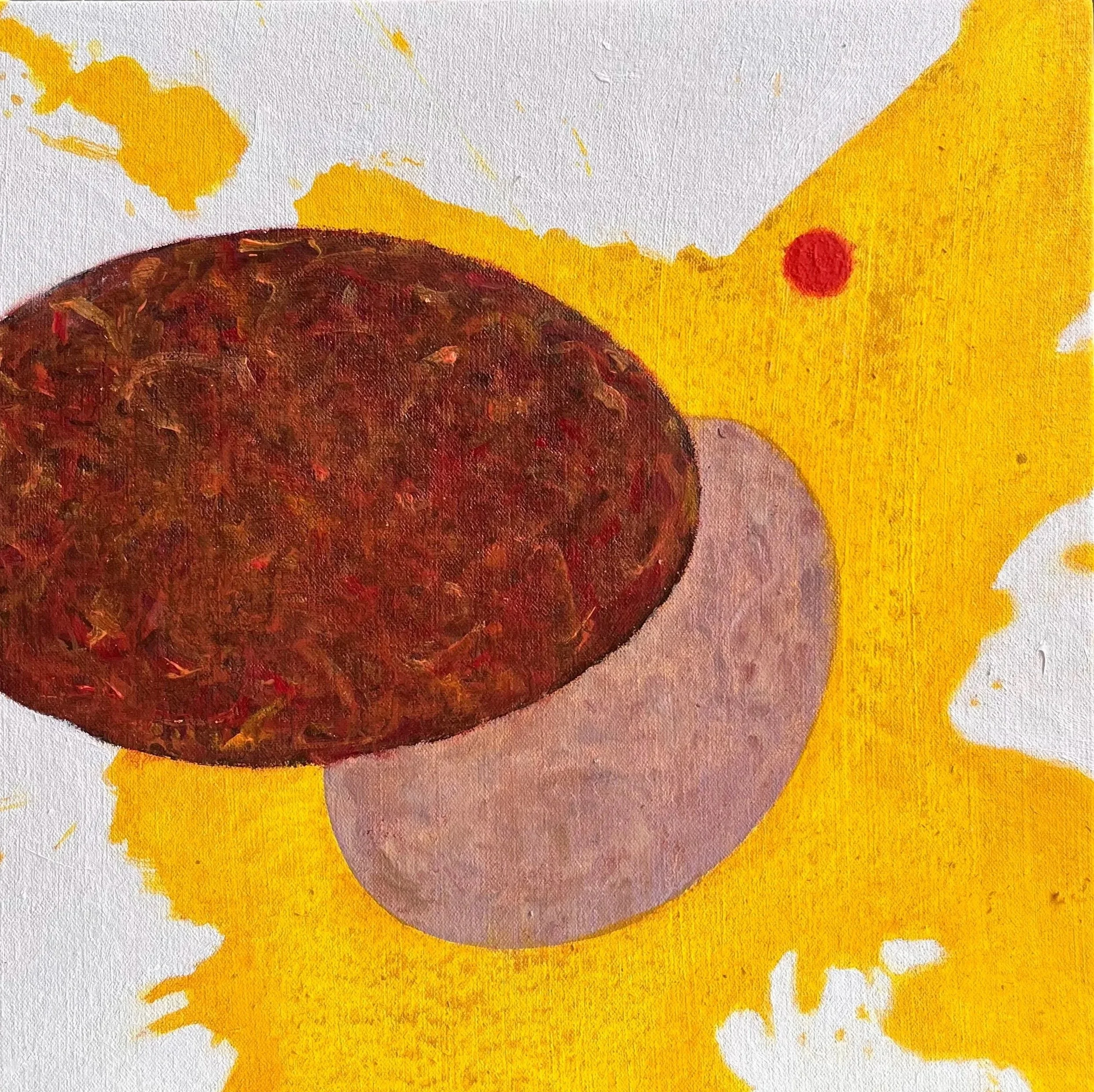
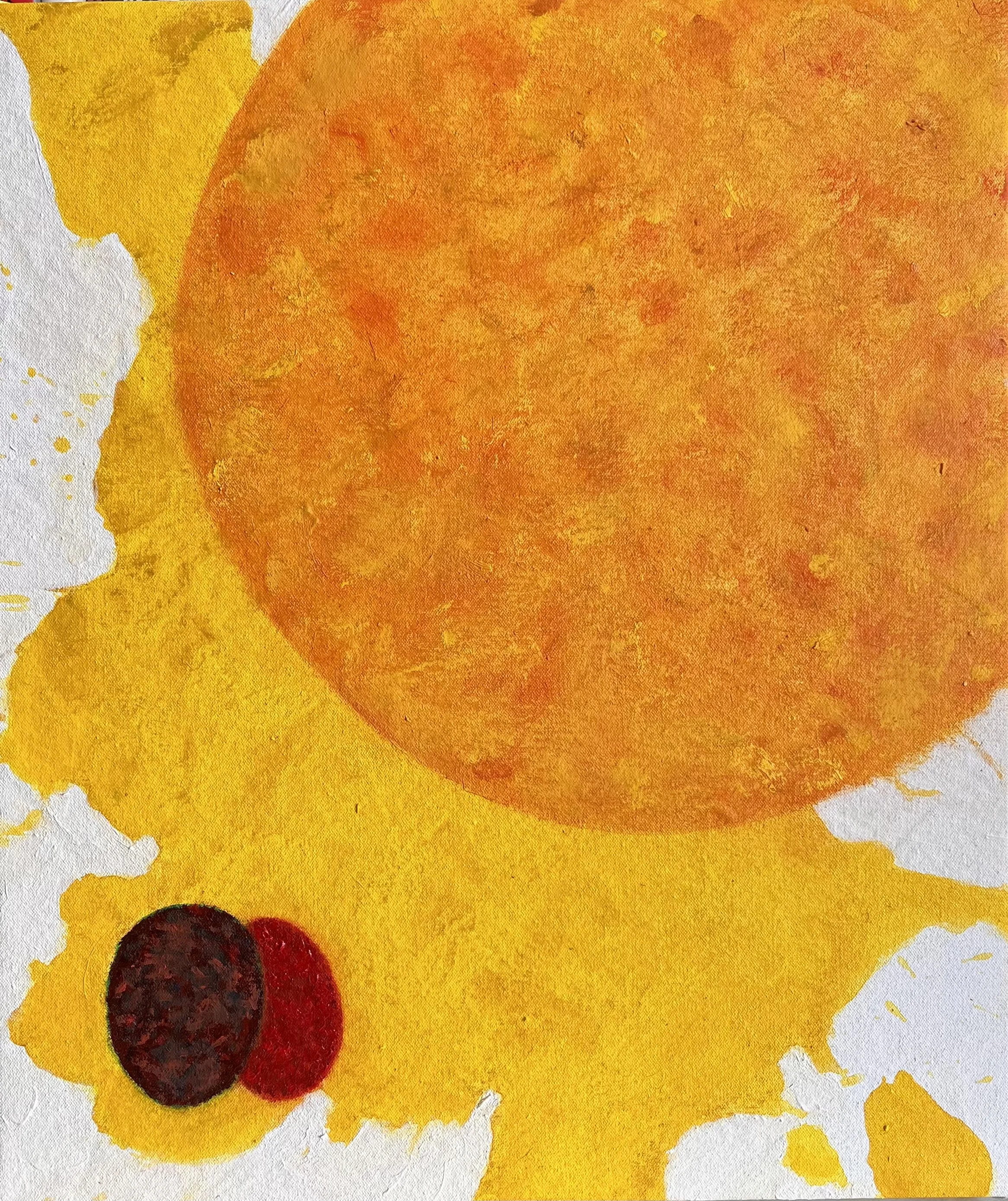
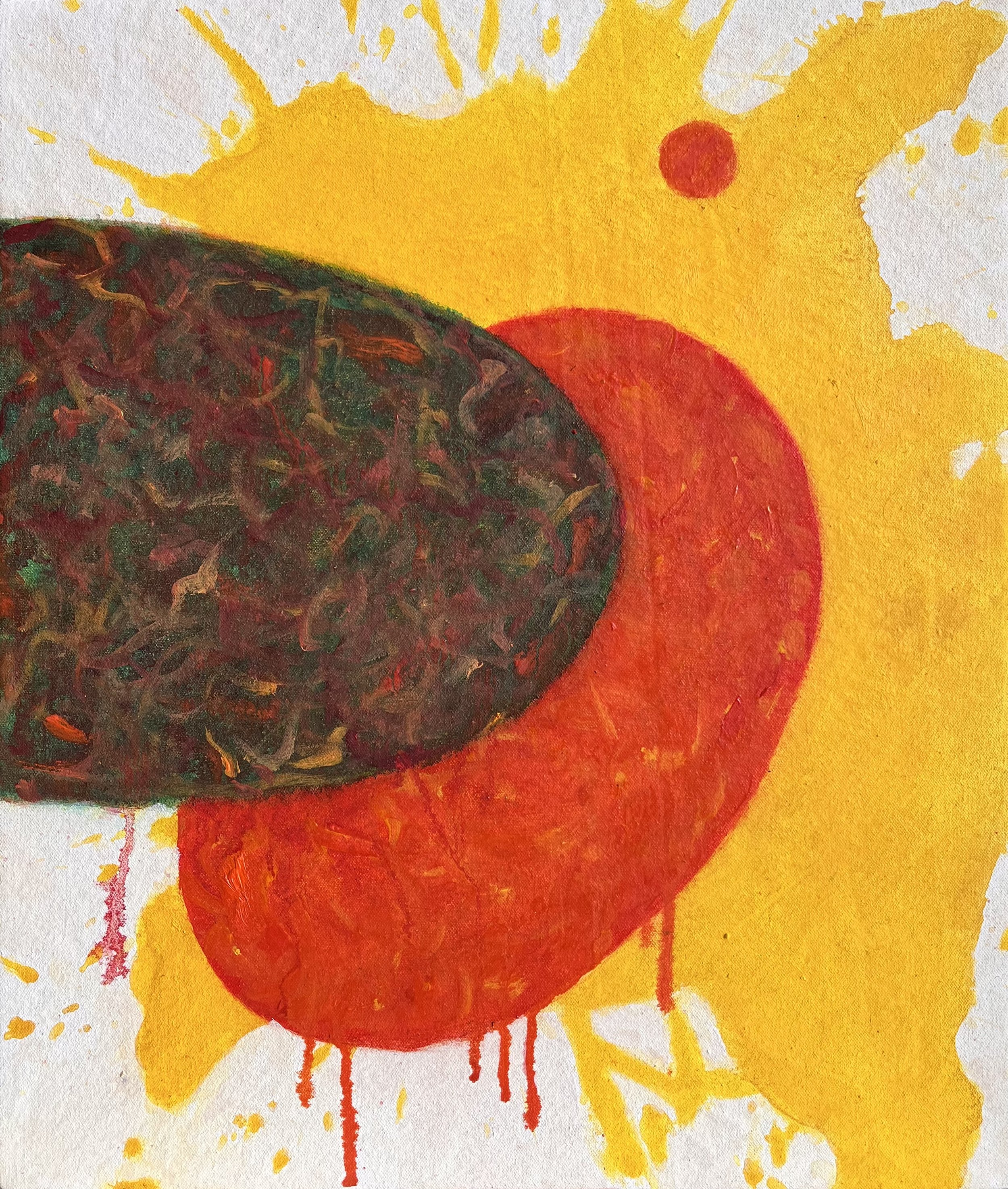
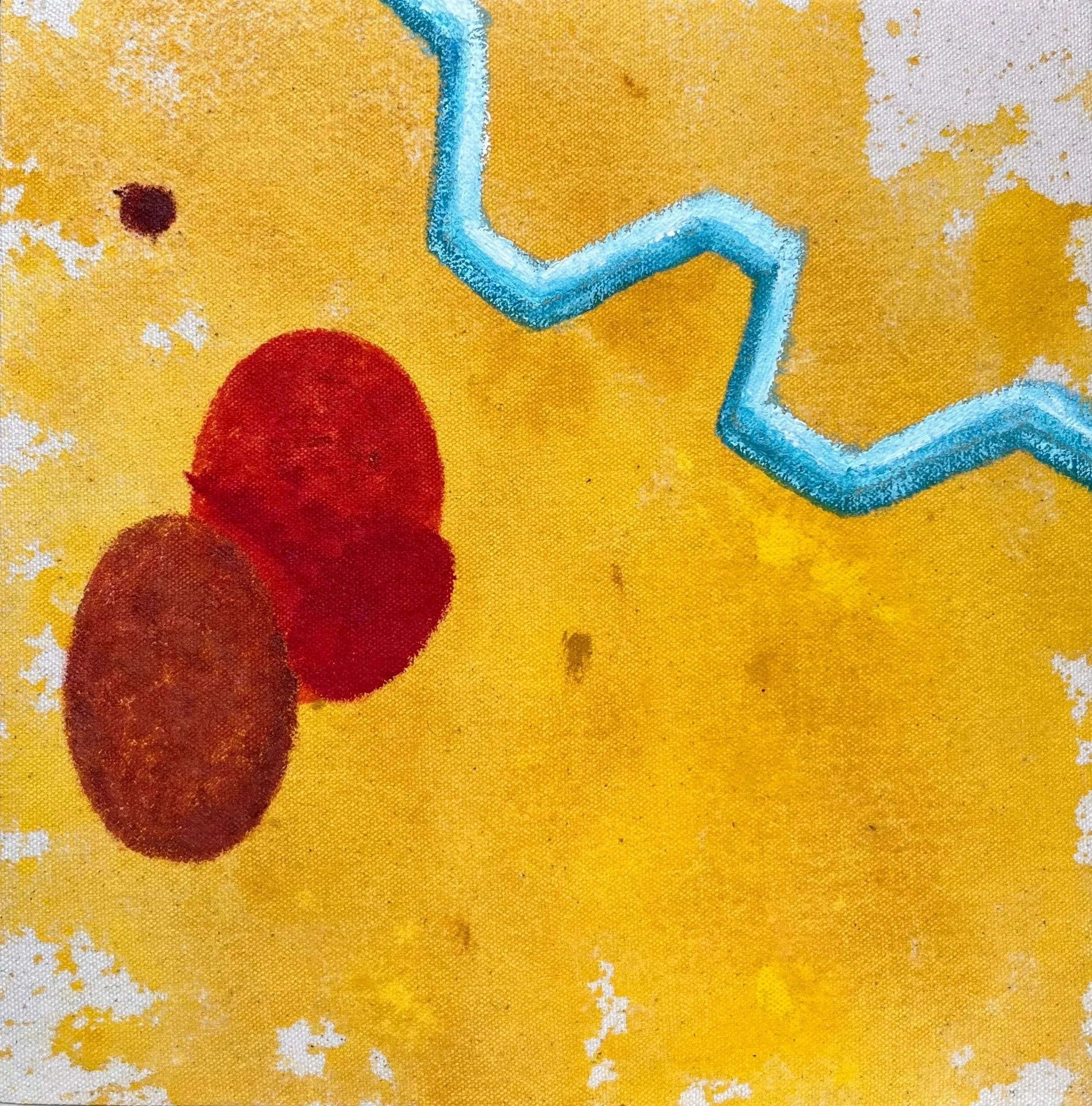
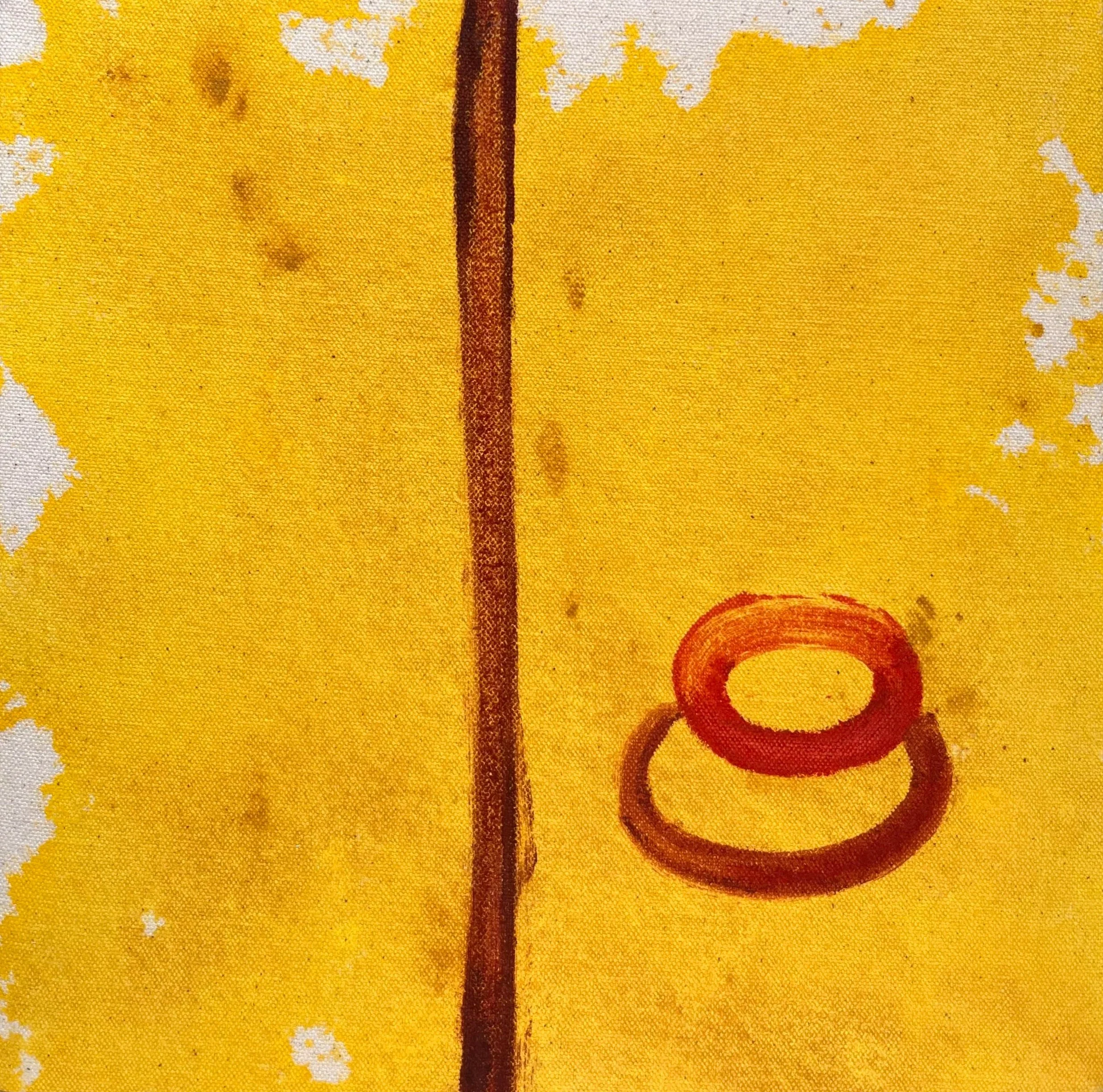
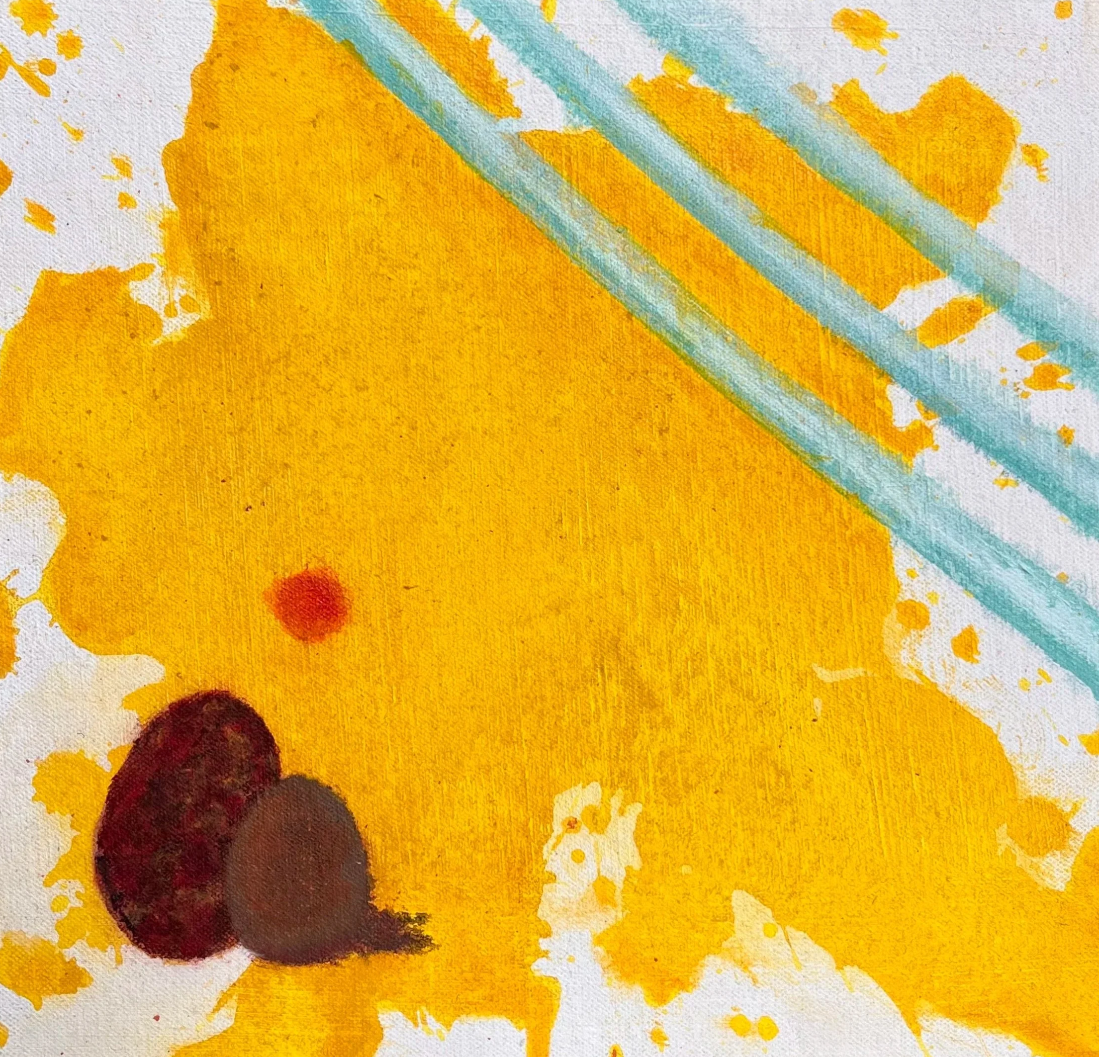
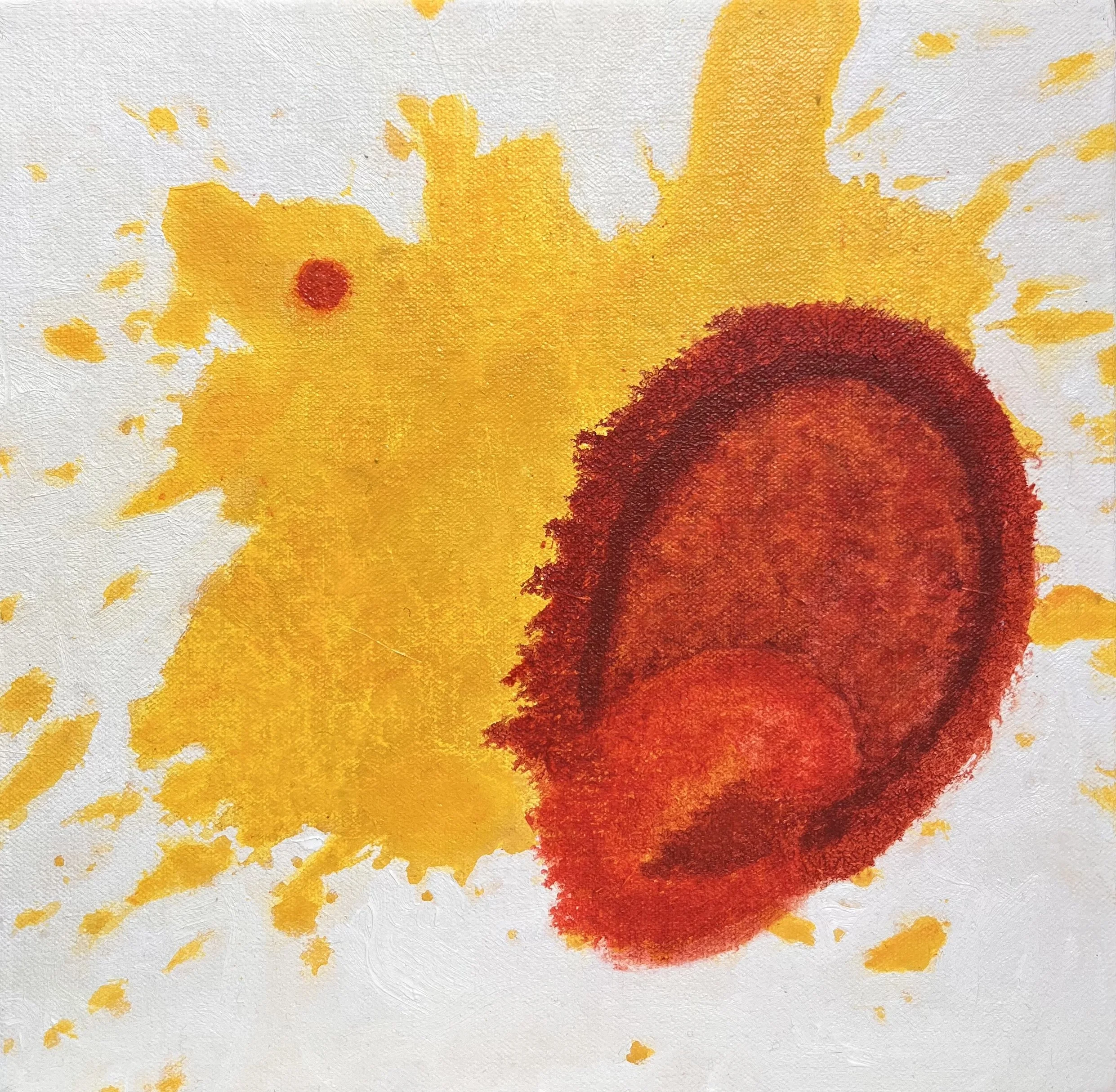
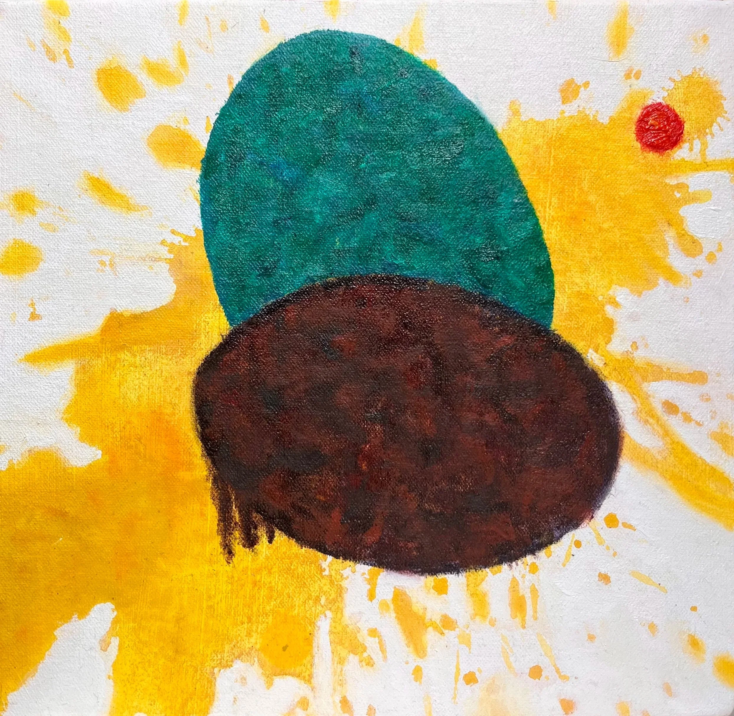
studio paintings
Created entirely in the studio, these purely painted works explore physical tension through contrasting applications of the medium across different surfaces.
In some pieces, heavily textured egg forms rest upon seductive, flat yellow grounds on primed canvas. This heavy application of oil purposefully breaks the glossy illusion of corporate branding to expose a messy, visceral reality underneath.
In other works, acrylic is applied to unprimed canvas, allowing the pigment to soak into the raw weave. This process removes the traditional finish of fine art to reveal the underlying support. This material investigation also extends to rigid wooden supports, as seen in YOLKO 22 (2026). The use of a raw wood panel further strips the work of fine art gloss, aligning it materially with the banal objects of consumption it critiques.
Across the series, the visual vocabulary includes graphic disruptions such as diagonal lines derived from single-use plastic straws and vertical motifs suggesting industrial machinery. These marks hover between decorative patterns and structures of confinement. By reducing imagery to these open emblems, the work avoids a singular narrative, instead focusing on the friction between manufactured aesthetics and systemic fragility.
YOLKO 24 (2025-2026) Oil and acrylic on canvas 35 x 42 cm
YOLKO 23 (2025-2026) Oil and acrylic on canvas 35 x 42 cm
YOLKO 22 (2026) Oil and acrylic on wood 24 × 30 cm
YOLKO 21 (2025-2026) Acrylic on unprimed canvas 55 × 55 cm
YOLKO 20 (2025-2026) Oil and acrylic on canvas 50 × 50 cm
YOLKO 19 (2025-2026) Oil and acrylic on canvas 30 × 30 cm
YOLKO 18 (2025-2026) Oil and acrylic on canvas 35 x 42 cm
YOLKO 17 (2025-2026) Oil and acrylic on canvas 35 x 42 cm
YOLKO 16 (2025-2026) Acrylic on unprimed canvas 18 × 18 cm
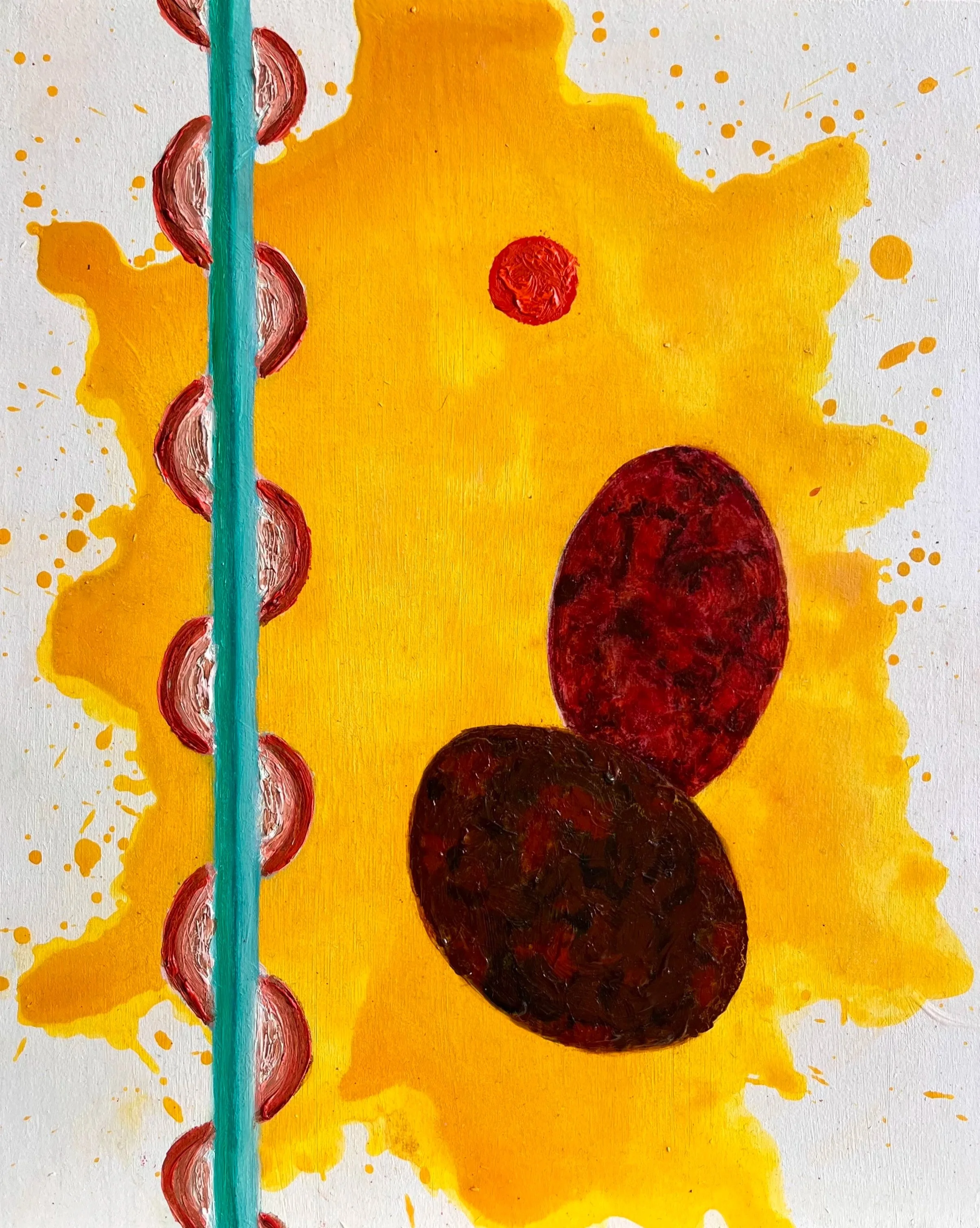
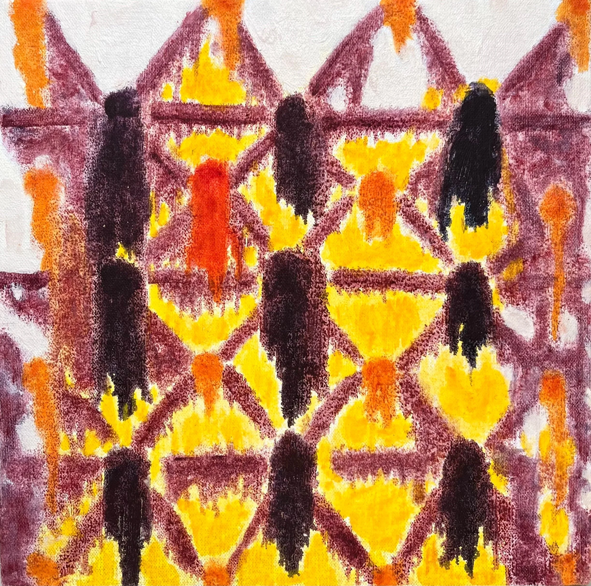
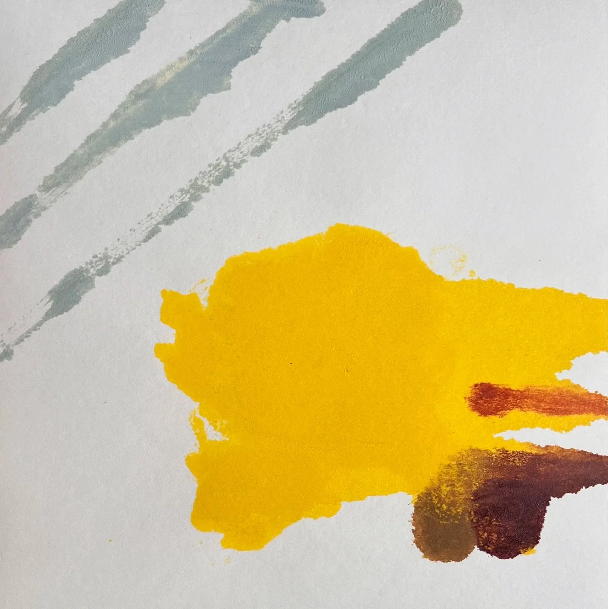
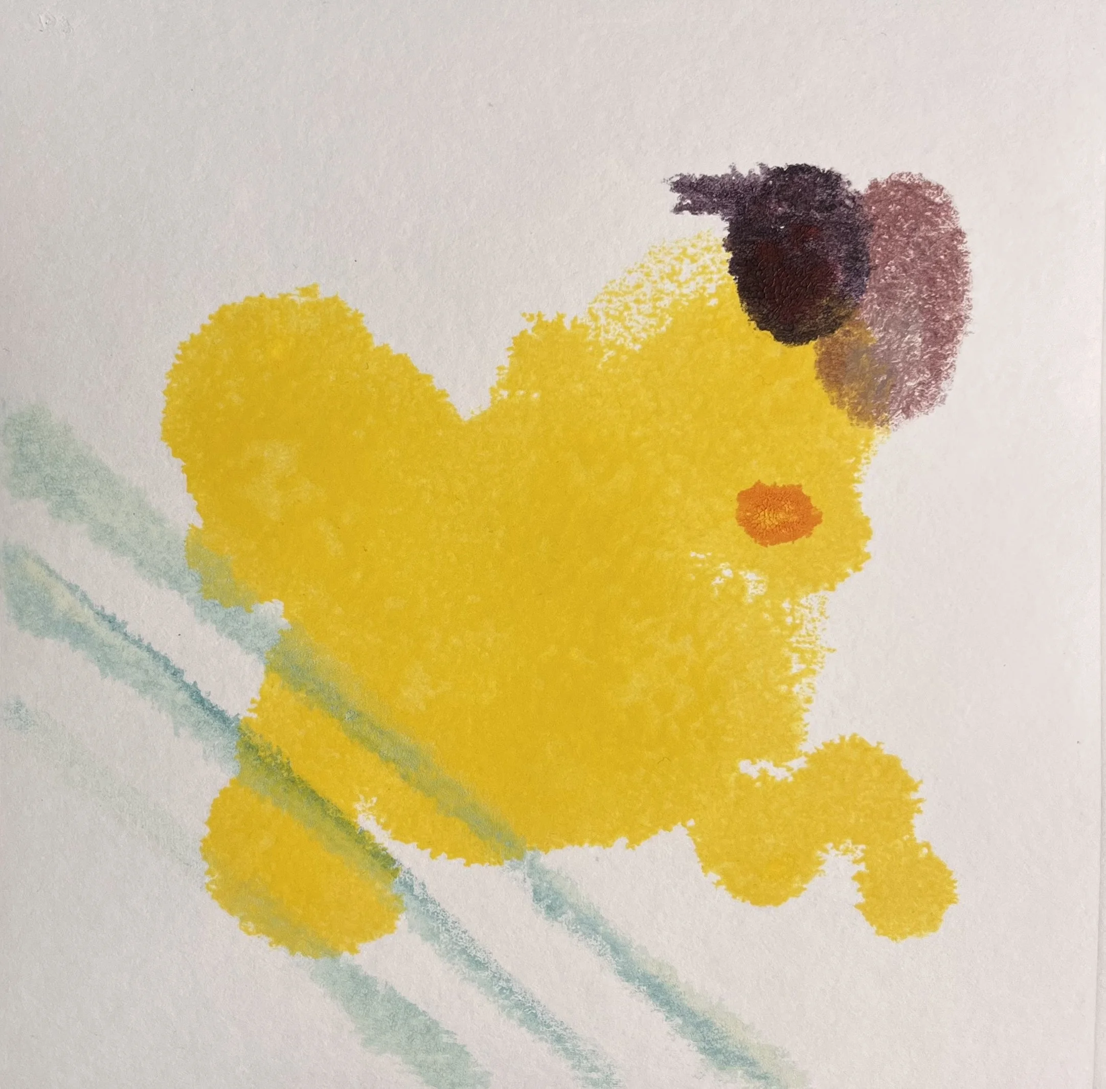
mixed media on canvas
Bridging the studio and the print room, these works are constructed through a multi-layered physical process. The canvases begin with initial applications of paint before a monotype layer is applied; they then return to the studio for final hand-applied interventions in oil and acrylic. This sequence examines how the flat, printed surface of commercial branding interacts with the tactile reality of paint.
A physical tension emerges between the mechanical printed elements and the heavier, textured painted forms. The visual vocabulary includes architectural elements based on egg cartons, which operate as grids or cages. This interplay between the cheerful palette of consumer packaging and the physical weight of the materials examines the structures of confinement inherent in industrial systems.
YOLKO 15 (2025-2026) Monotype and acrylic on unprimed canvas 20 × 20 cm
YOLKO 14 (2025-2026) Monotype and acrylic on unprimed canvas 20 × 20 cm
YOLKO 13 (2025-2026) Monotype, oil, and acrylic on canvas 20 × 20 cm
YOLKO 12 (2025-2026) Monotype, oil, and acrylic on canvas 20 × 20 cm
YOLKO 11 (2025-2026) Monotype, oil, and acrylic on canvas 20 × 20 cm
YOLKO 10 (2025-2026) Monotype, oil, and acrylic on canvas 20 × 20 cm
YOLKO 9 (2025-2026) Monotype, oil, and acrylic on canvas 20 × 20 cm
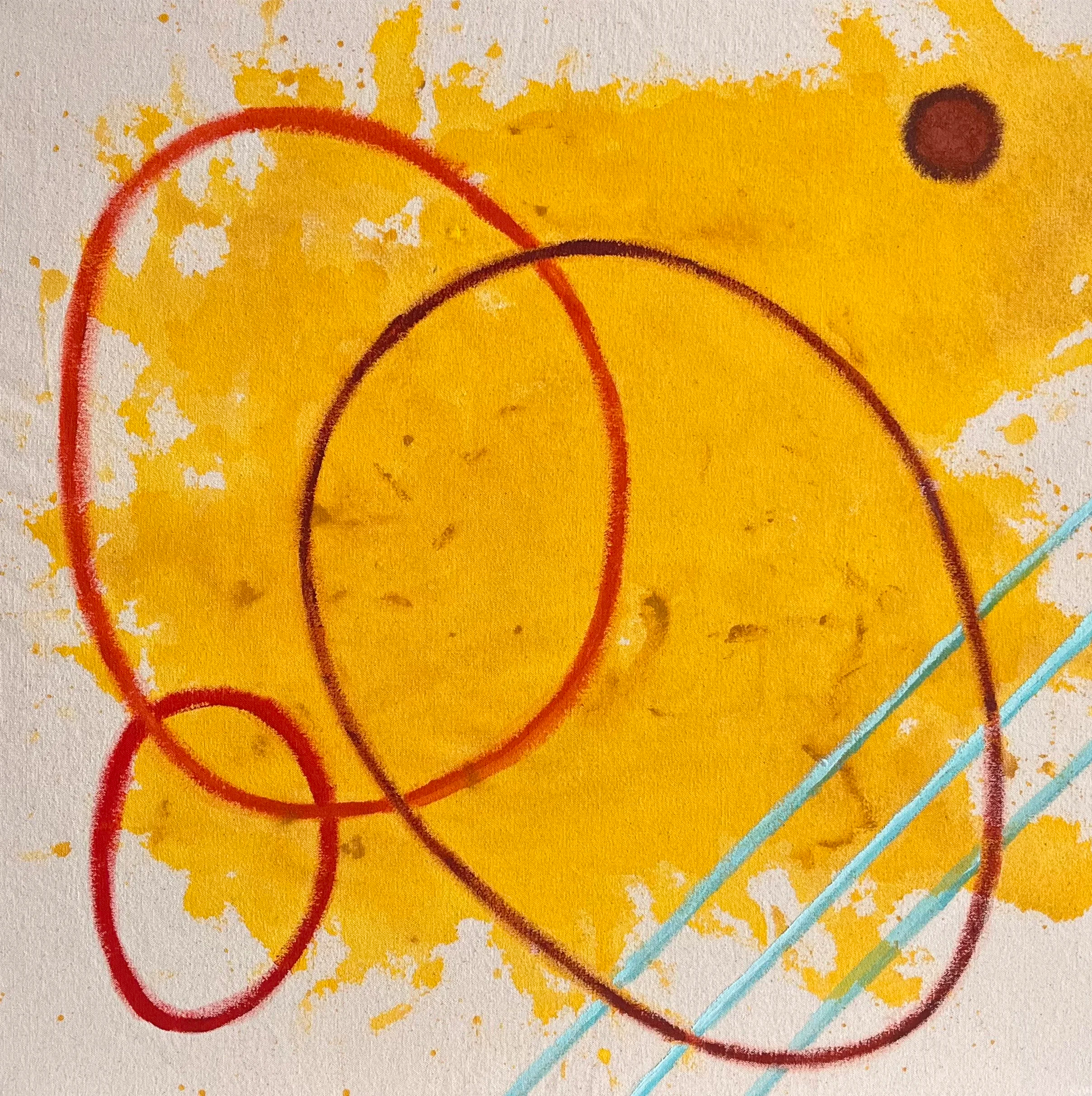
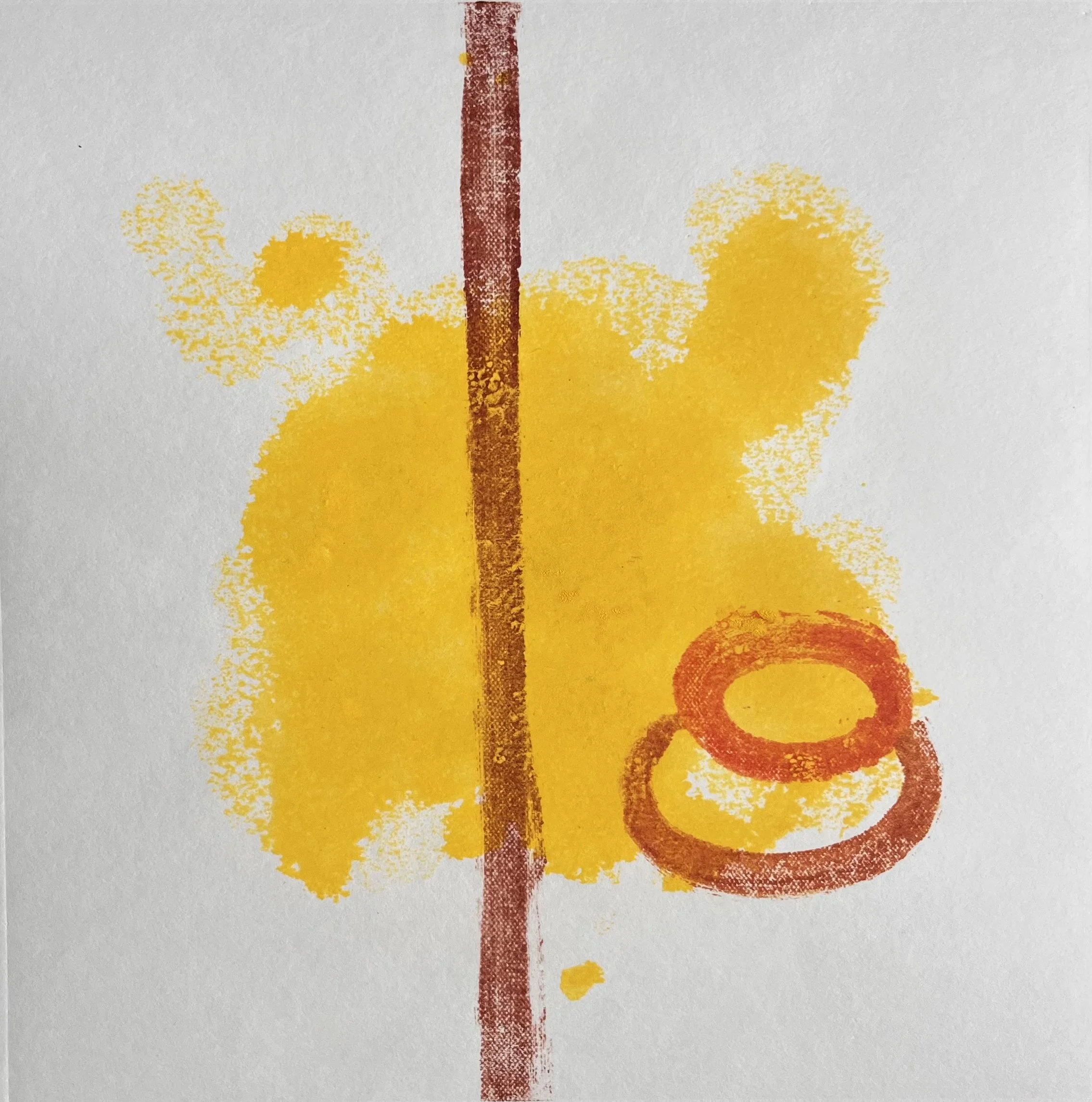
monotypes
The monotype process examines the intersection of human agency and industrialised systems. Each print involves a dual process: the initial hand-painted layer preserves the physical trace of the artist, while the subsequent mechanical pressing evokes the standardising effects of mass production. This method ensures each print remains a unique object, even as it is generated through a mechanised system.
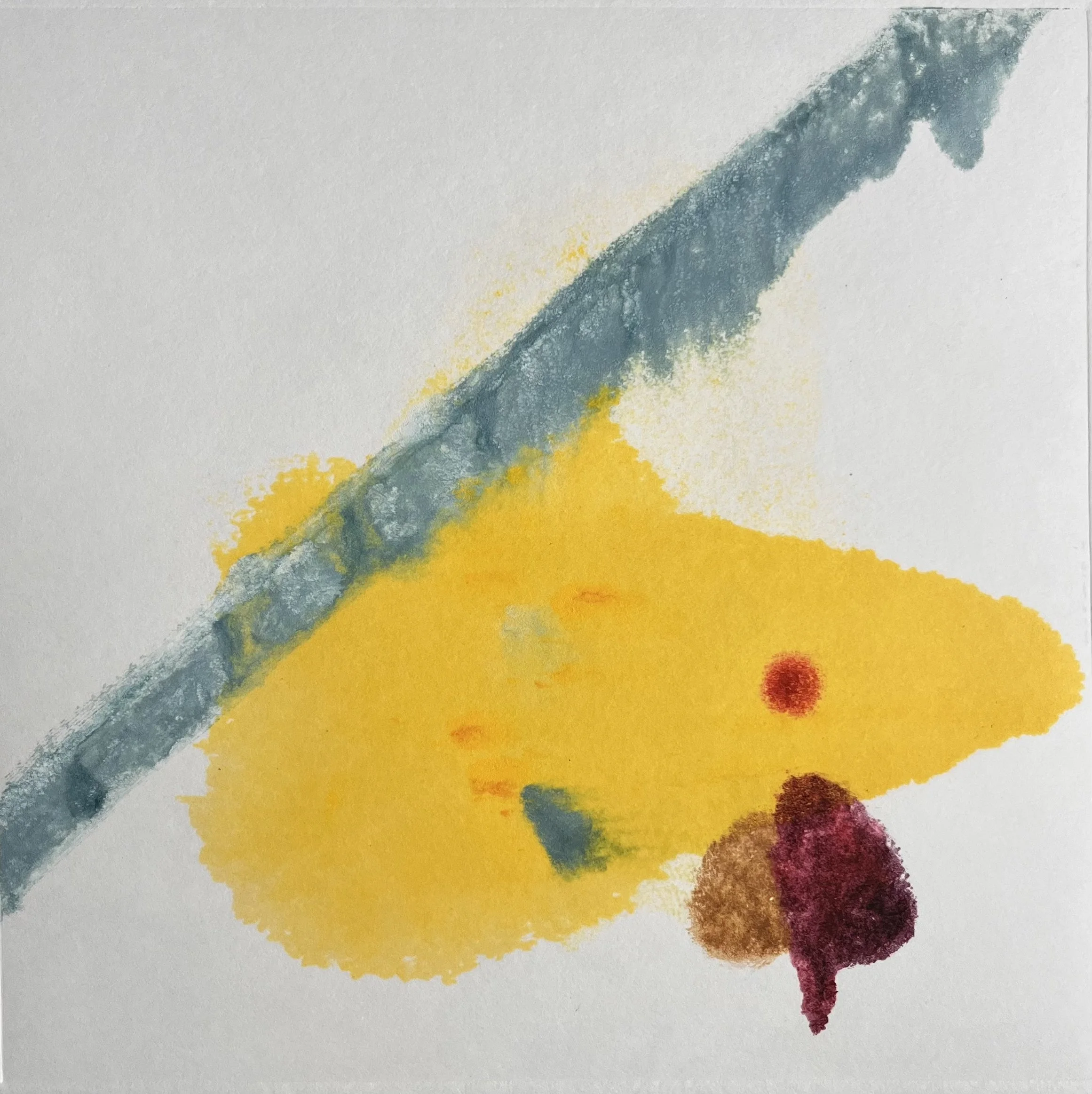
YOLKO 8 (2025) Monotype on paper 20.5 × 20.5 cm
YOLKO 7 (2025) Monotype on paper 20.5 × 20.5 cm
YOLKO 6 (2025) Monotype on paper 20.5 × 20.5 cm
YOLKO 5 (2025) Monotype on paper 20.5 × 20.5 cm
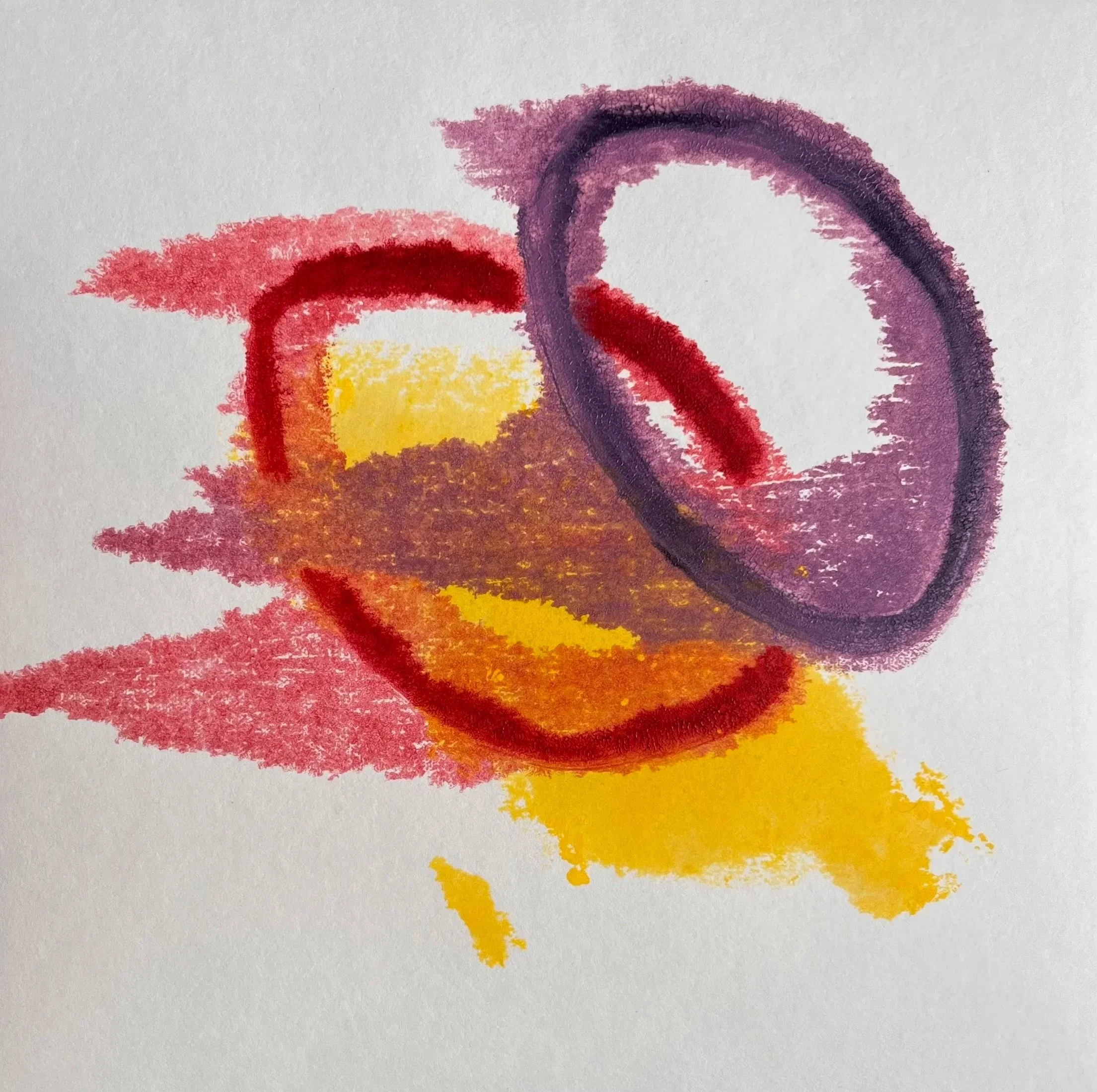
YOLKO 4 (2025) Monotype on paper 20.5 × 20.5 cm
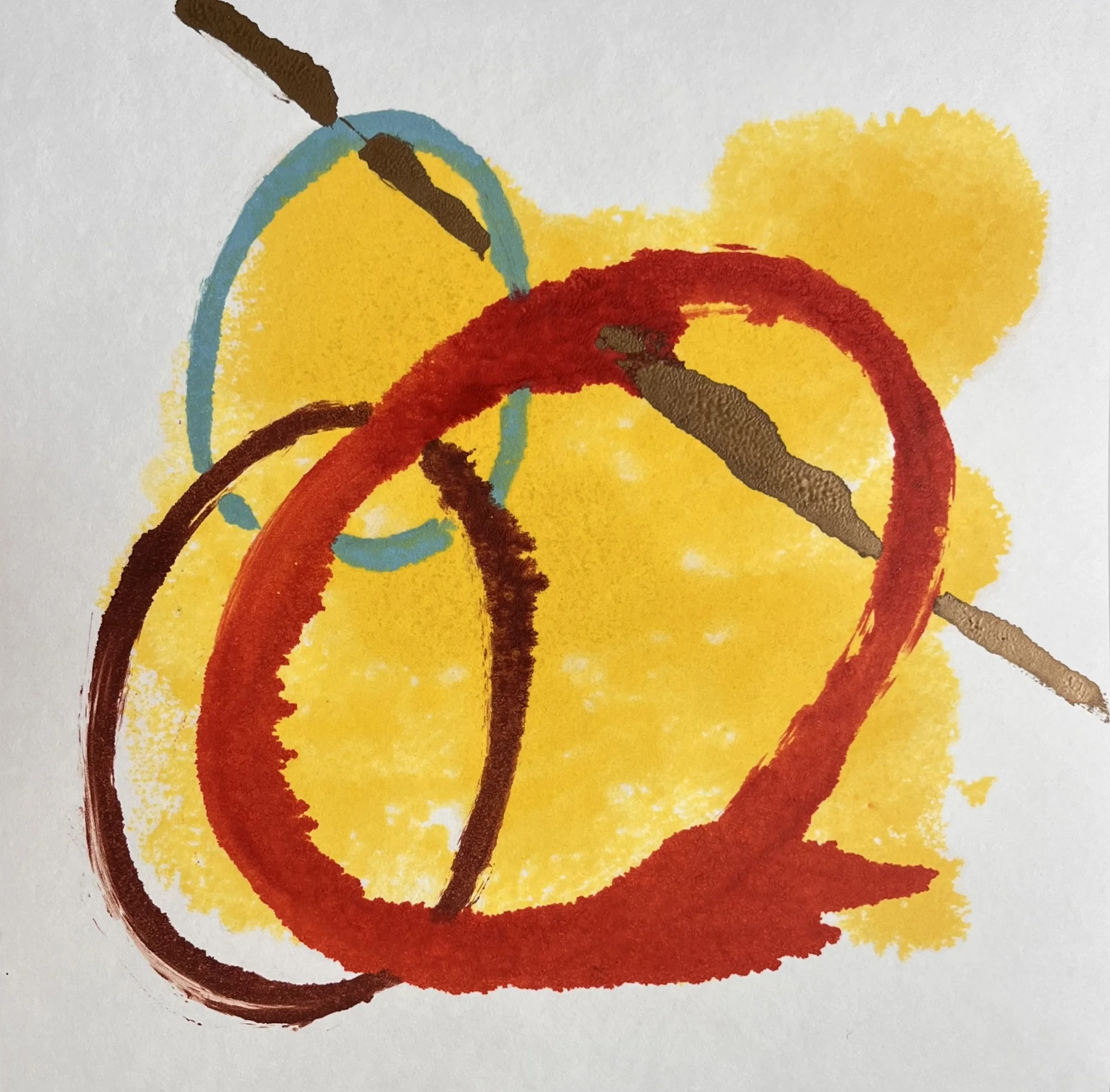
YOLKO 3 (2025) Monotype on paper 20.5 × 20.5 cm
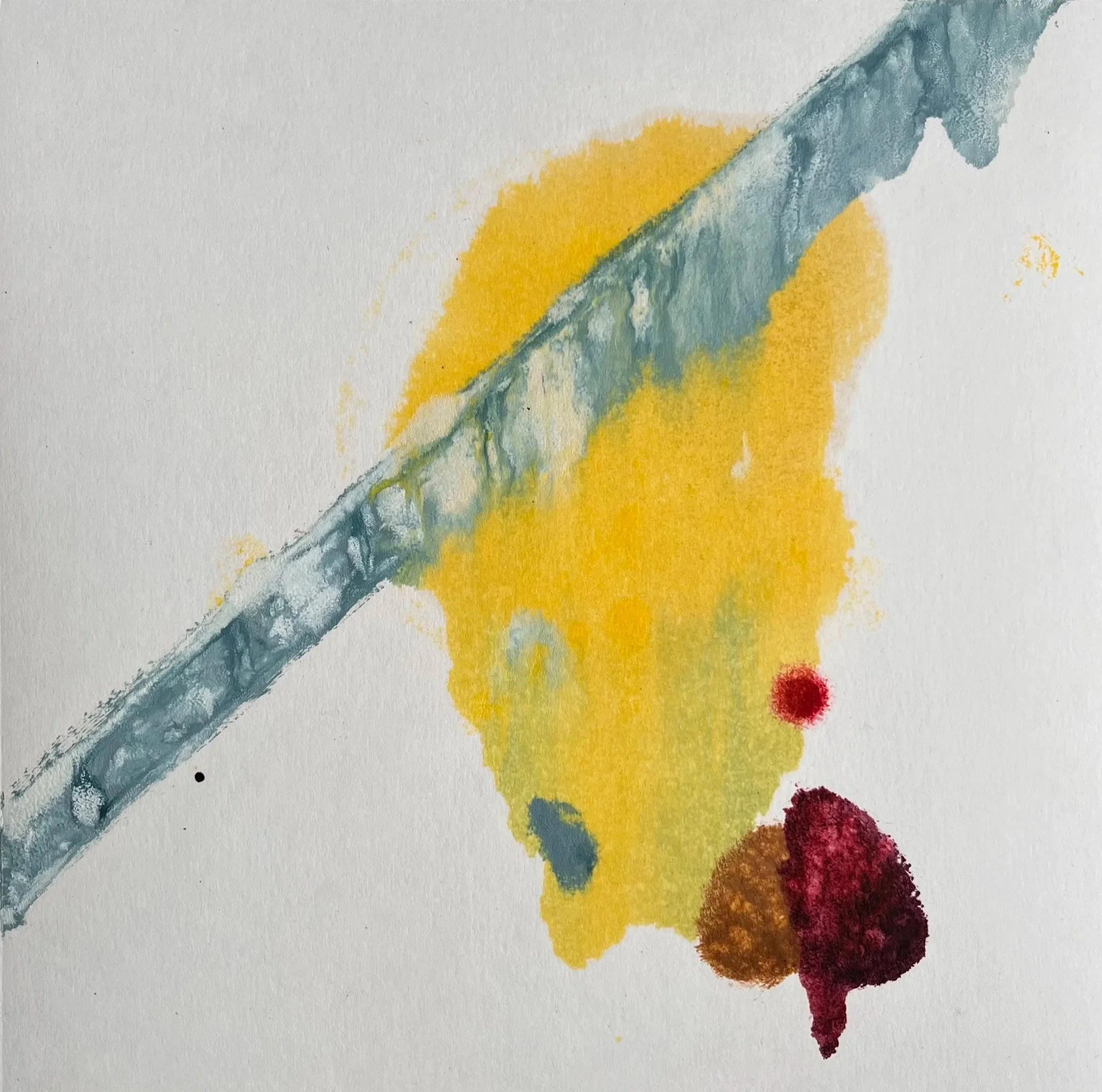
YOLKO 2 (2025) Monotype on paper 20.5 × 20.5 cm
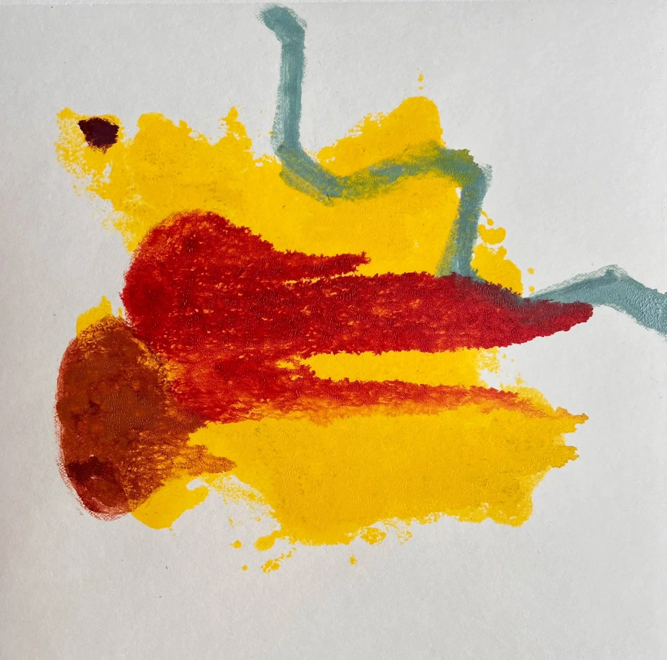
YOLKO 1 (2025) Monotype on paper 20.5 × 20.5 cm