YOLKO series
The YOLKO series functions as an autoethnographic critique of consumer aesthetics. Drawing on a twenty-year career in global brand direction and marketing, the work serves as an act of visual reverse-engineering. It deconstructs the polished veneers of corporate persuasion to examine the underlying mechanisms of commercial branding.
By appropriating the saturated colours of supermarket packaging alongside raw, unforgiving materials, the work explores the distance between natural origins and industrial confinement. The title itself merges the organic ‘yolk’ with the synthetic naming conventions of processed foods (echoing brands like JELLO), while the ‘O’ also references the recurring circular forms found throughout the broader practice. Spanning primed and unprimed canvas, printmaking, and cast glass, the series avoids didactic narratives. Instead, it holds systemic critique in direct balance with the visual seduction of commercial design.
YOLKO (2026)
Acrylic on unprimed canvas
166 x 166 cm
structural interventions
Translating this conceptual critique into three-dimensional space requires abandoning the flat veneer of commercial branding to physically enact an architecture of restriction. Rejecting standard gallery plinths in favour of raw wood and chicken wire brings the systemic violence and quantifiable reality of mass consumption directly into the physical space.
By building the raw wood and wire cage plinth to exactly 90 cm (the standard height of a UK kitchen counter), the structure acts as a spatial anchor that mimics the corruption of the everyday. The slumped glass acts as a ghost object, materialising the invisible systems of mass consumption. Preserving the structural irregularities of the hand-cast eggs actively rejects industrial uniformity, while calculated empty pockets materialise the absent subject and invoke a deep sense of biological vulnerability.
Similarly, exploring cast Jesmonite tests the material tension between skeletal decay and biological vulnerability. Resting the chalky carton on the wire cage plinth physically frames it within an architecture of restriction. Introducing fragile glass eggs and a mirror beneath the structure actively implicates the viewer. The mirrored surface functions as a physical prompt to look inward, signalling personal complicity and the hidden consequences of mass consumption.
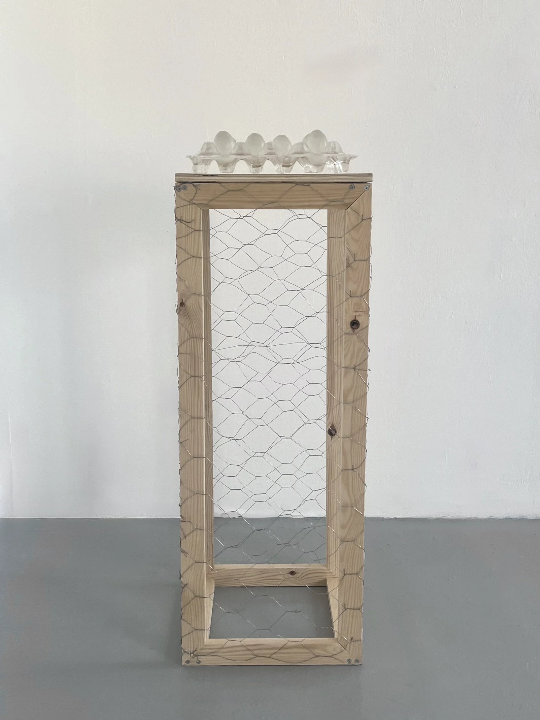
Untitled (Glass Carton with Eggs), 2025–2026 Slumped and cast glass on custom wood and chicken wire cage plinth. Carton: 8 x 30 x 30 cm. Plinth: 90 x 34 x 34 cm.
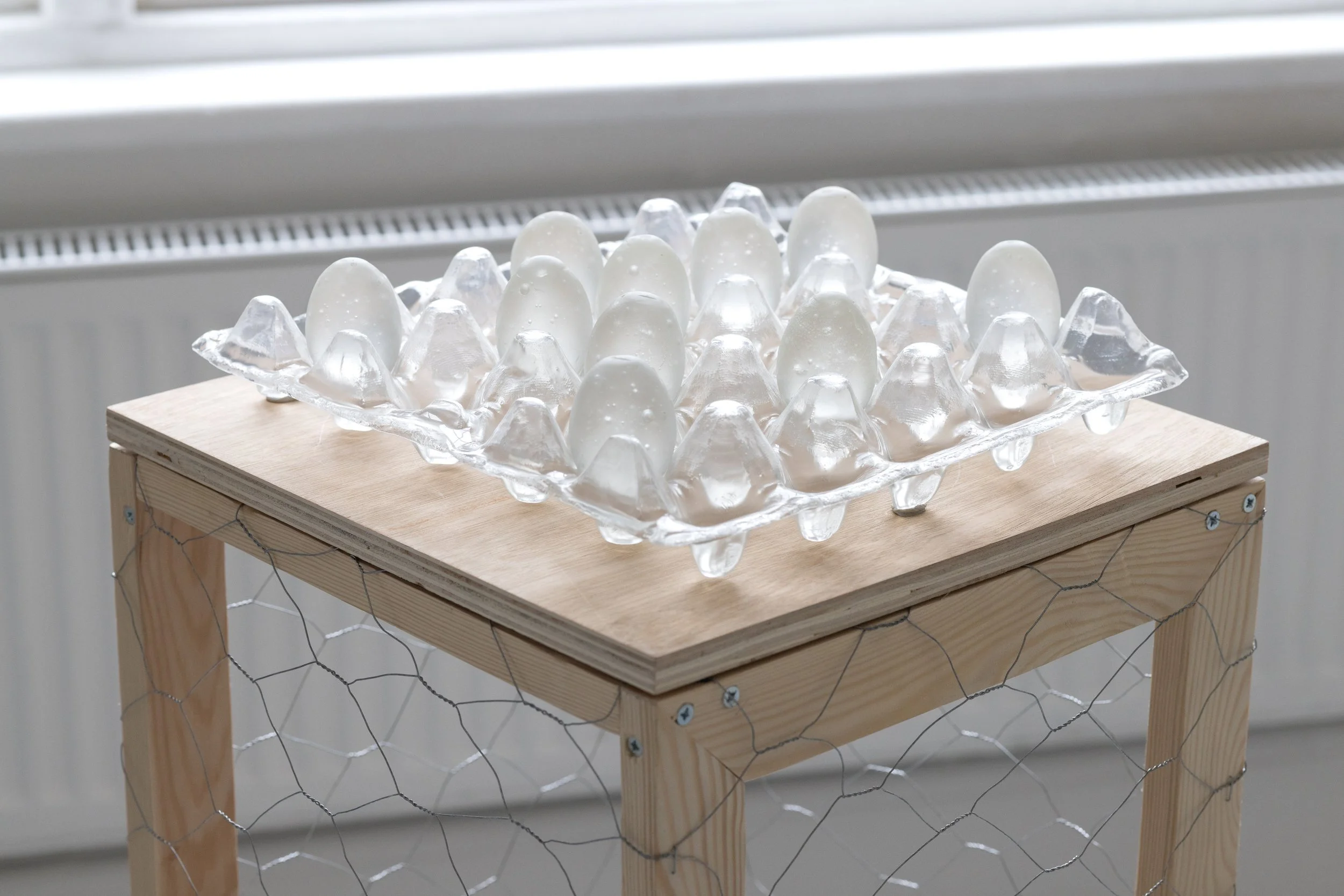
Untitled (Glass Carton with Eggs), 2025–2026 Slumped and cast glass on custom wood and chicken wire cage plinth. Carton: 8 x 30 x 30 cm. Plinth: 90 x 34 x 34 cm.
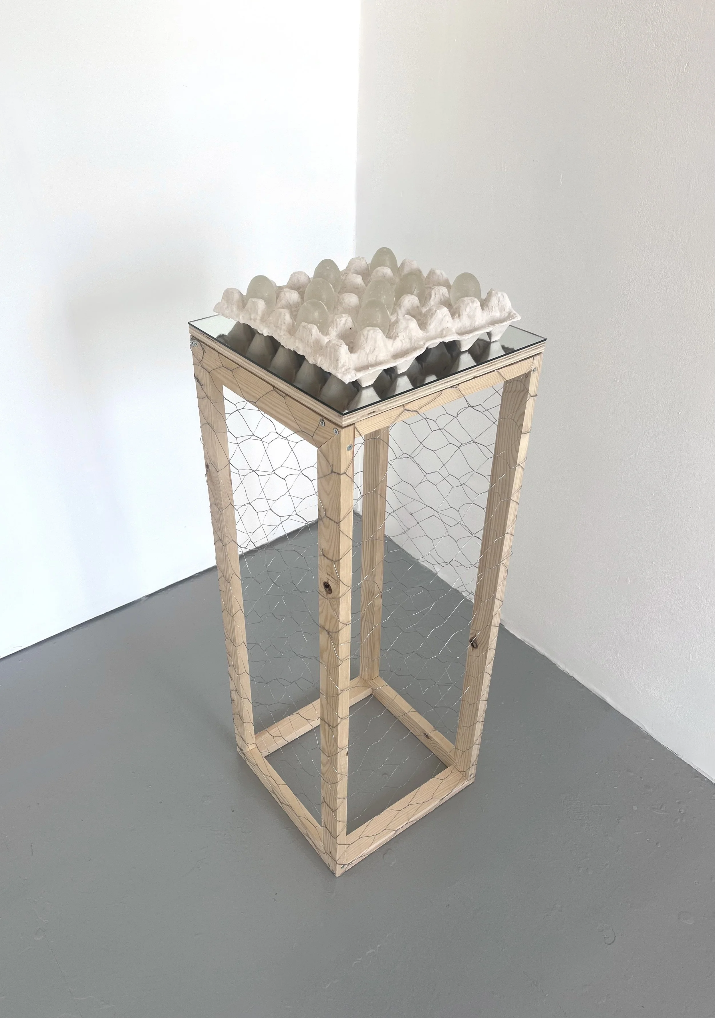
Untitled (Jesmonite Carton with Glass), 2025–2026 Cast Jesmonite, cast glass, mirror, and wire cage. Carton: 9 x 30 x 30 cm. Plinth: 90 x 34 x 34 cm.
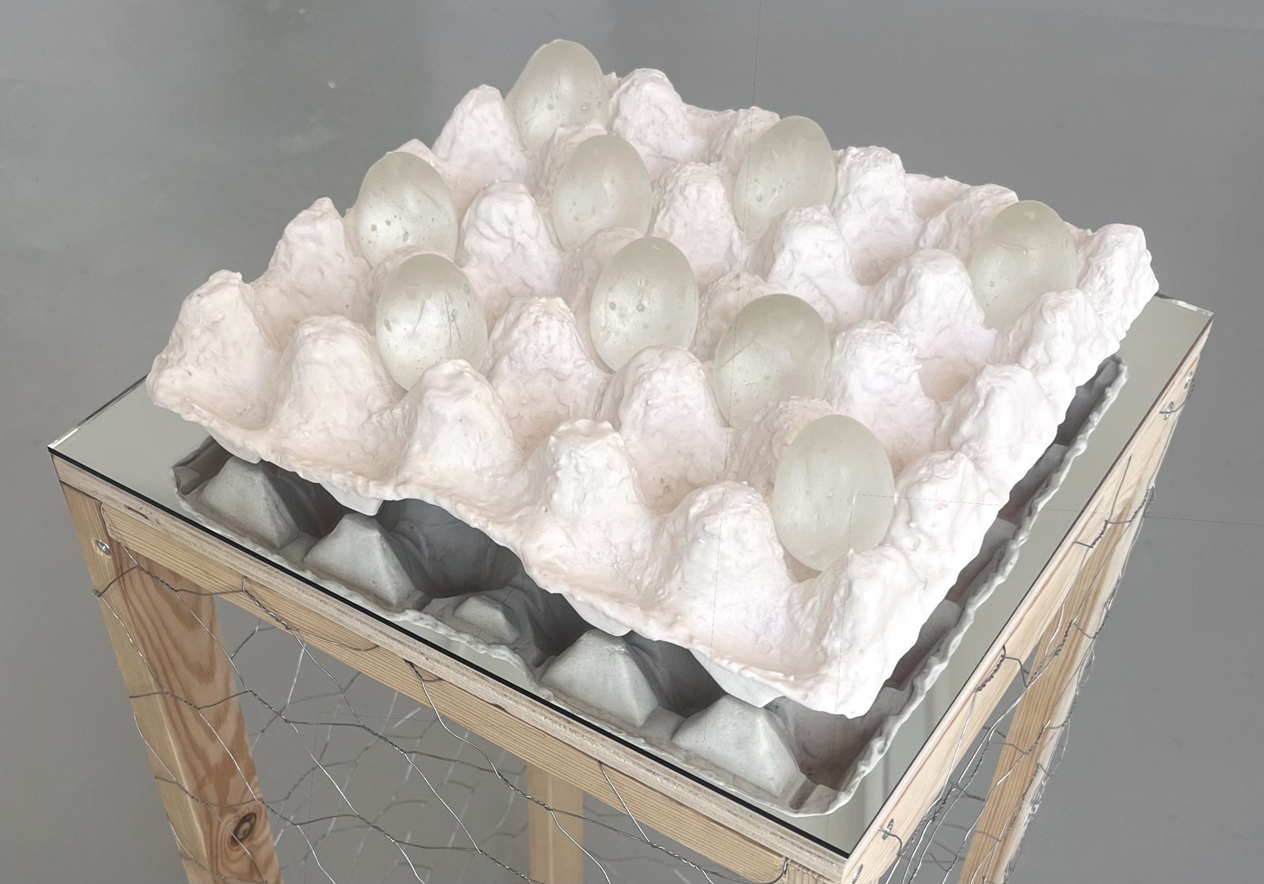
Untitled (Jesmonite Carton with Glass), 2025–2026 Cast Jesmonite, cast glass, mirror, and wire cage. Carton: 9 x 30 x 30 cm. Plinth: 90 x 34 x 34 cm.
biological foundations
In direct contrast to the pristine finish of the macro campaign, these works explore the physical reality concealed behind commercial packaging.
Executed on raw, unprimed canvas, pieces such as YOLKO 27 and the culminating degree show canvas, YOLKO, abandon the highly controlled application of oil glazes. Instead, they rely on watery acrylic bleeds and intentional drips that absorb directly into the unprotected weave of the fabric.
By removing structural interventions and submitting to gravity, this phase of the project acts as the conceptual counterweight to the advertising campaign. It strips away the polished veneer entirely to offer a quiet, expansive space of ultimate biological vulnerability.
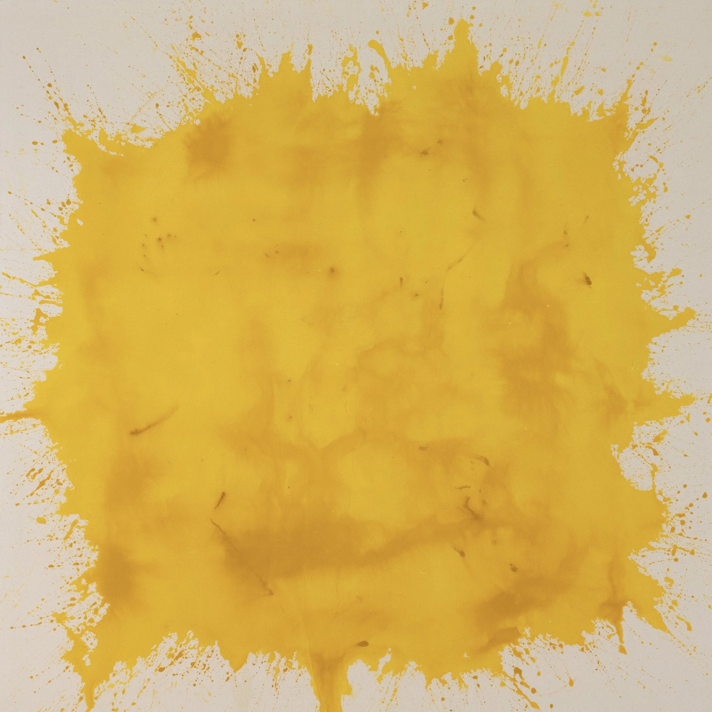
YOLKO (2026) Acrylic on unprimed canvas 166 x 166 cm
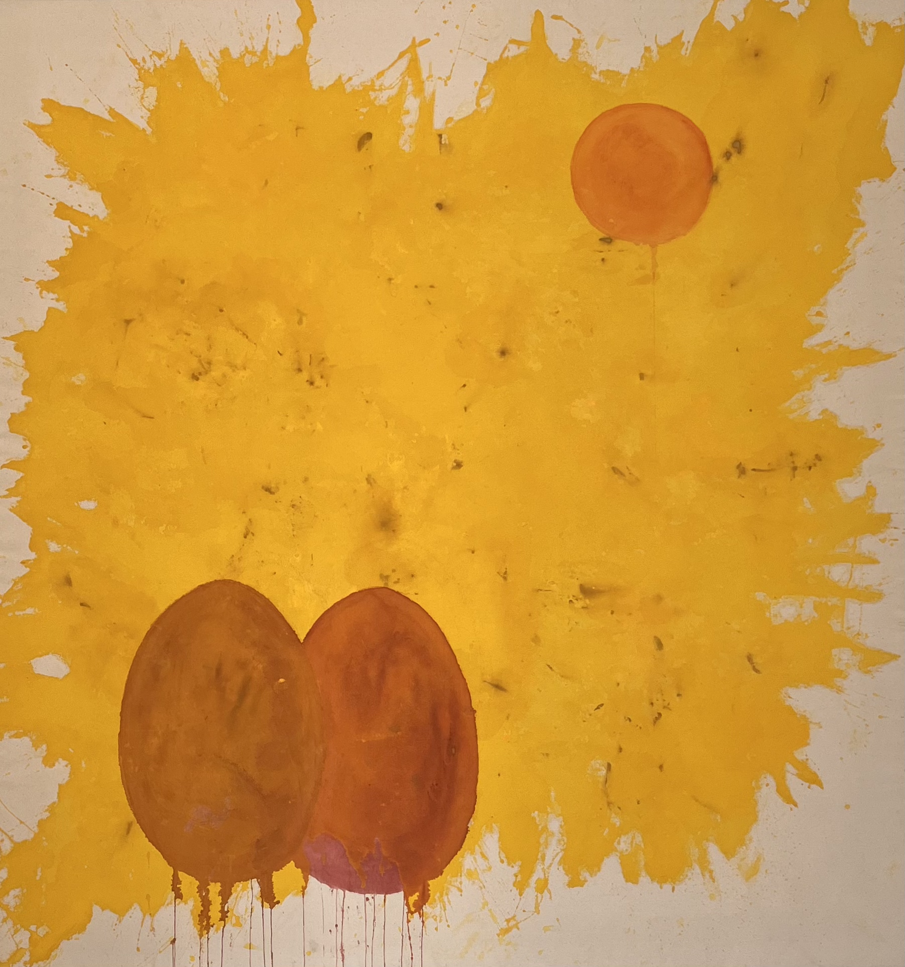
YOLKO 27 (2026) Acrylic on unprimed canvas 166 x 156 cm
the process of reductions
Representing a pivotal moment of reduction in the studio, these works explore material vulnerability across contrasting scales. While the expansive, unprimed canvas of YOLKO 27 establishes a raw biological ground, this deliberate lack of control is distilled further in the intimate canvases of YOLKO 28, 29, and 30. In these smaller works, simple forms applied in the print room were intentionally left exposed. By refusing to polish or overpaint these prints in the studio, the pieces embrace a quiet vulnerability, paving the way for the final, un-intervened canvas.
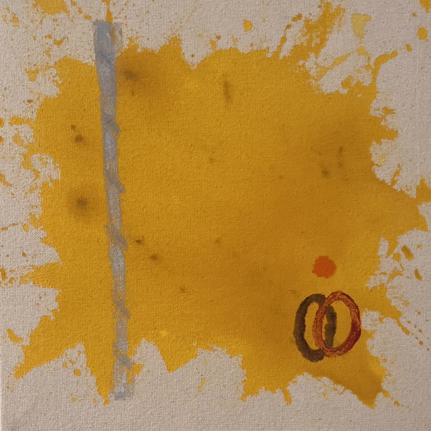
YOLKO 30 Monotype and acrylic on unprimed canvas 26 x 26 cm
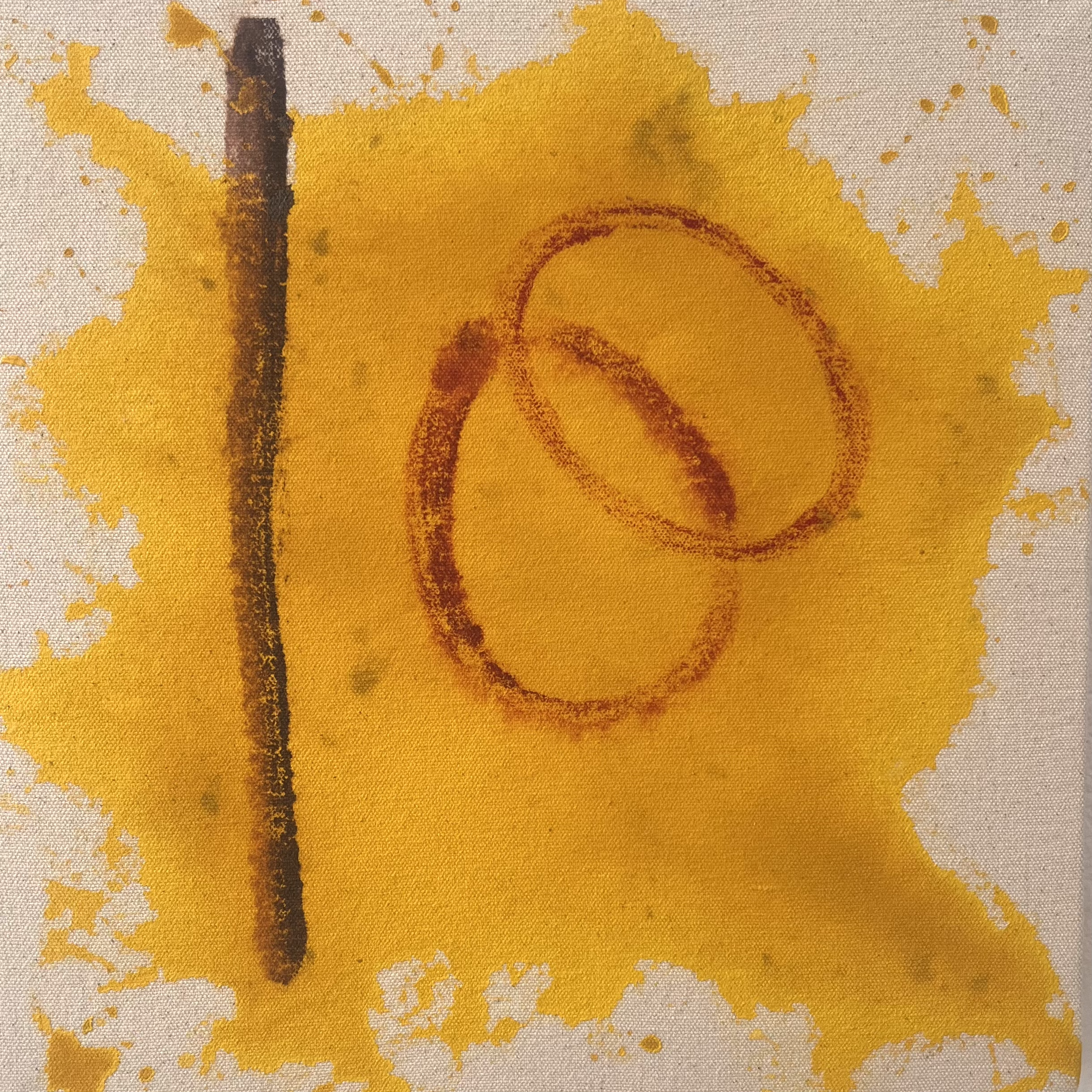
YOLKO 29 Monotype and acrylic on unprimed canvas 26 x 26 cm
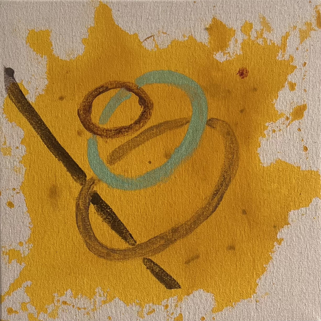
YOLKO 28 Monotype and acrylic on unprimed canvas 26 x 26 cm
macro paintings
Created entirely in the studio, the broader series is structurally designed to reverse-engineer a multi-layered global marketing campaign. By weaponising the advertising principles of frequency and repetition, the works operate as a network of interconnected touchpoints, exposing how systems successfully manufacture consumer desire.
Anchoring the campaign are monumental hero canvases, specifically YOLKO 25 and YOLKO 26, scaled to mimic the overwhelming physical presence of corporate billboards. Executed on stretched, primed canvas, these large works contrast fluid, viscous acrylic washes against targeted, luminous oil glazes. This deliberate material dissonance replicates the pristine, seductive veneer of commercial advertising at a macro scale.
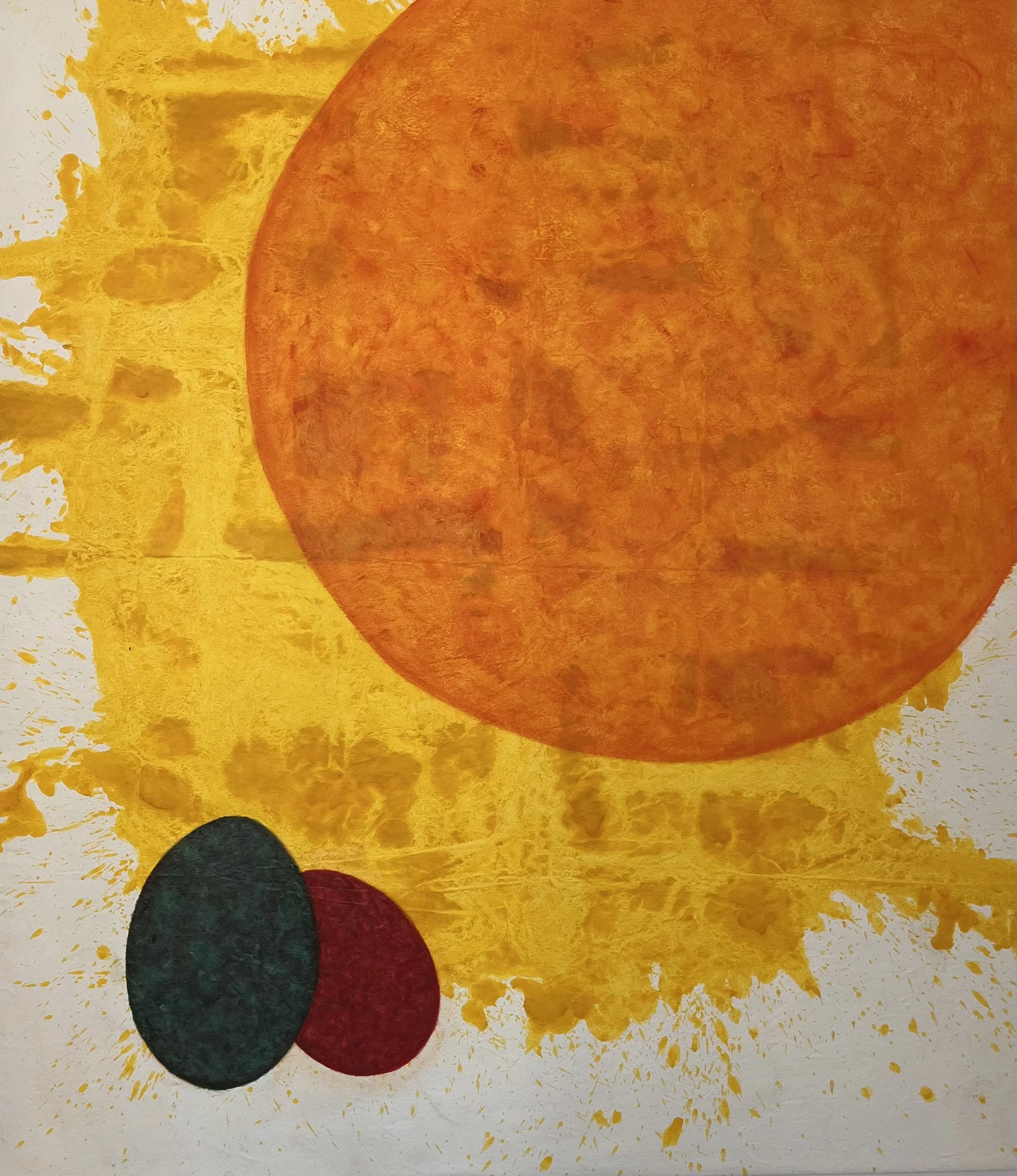
YOLKO 26 (2025–2026) Oil and acrylic on canvas 191 x 168 cm
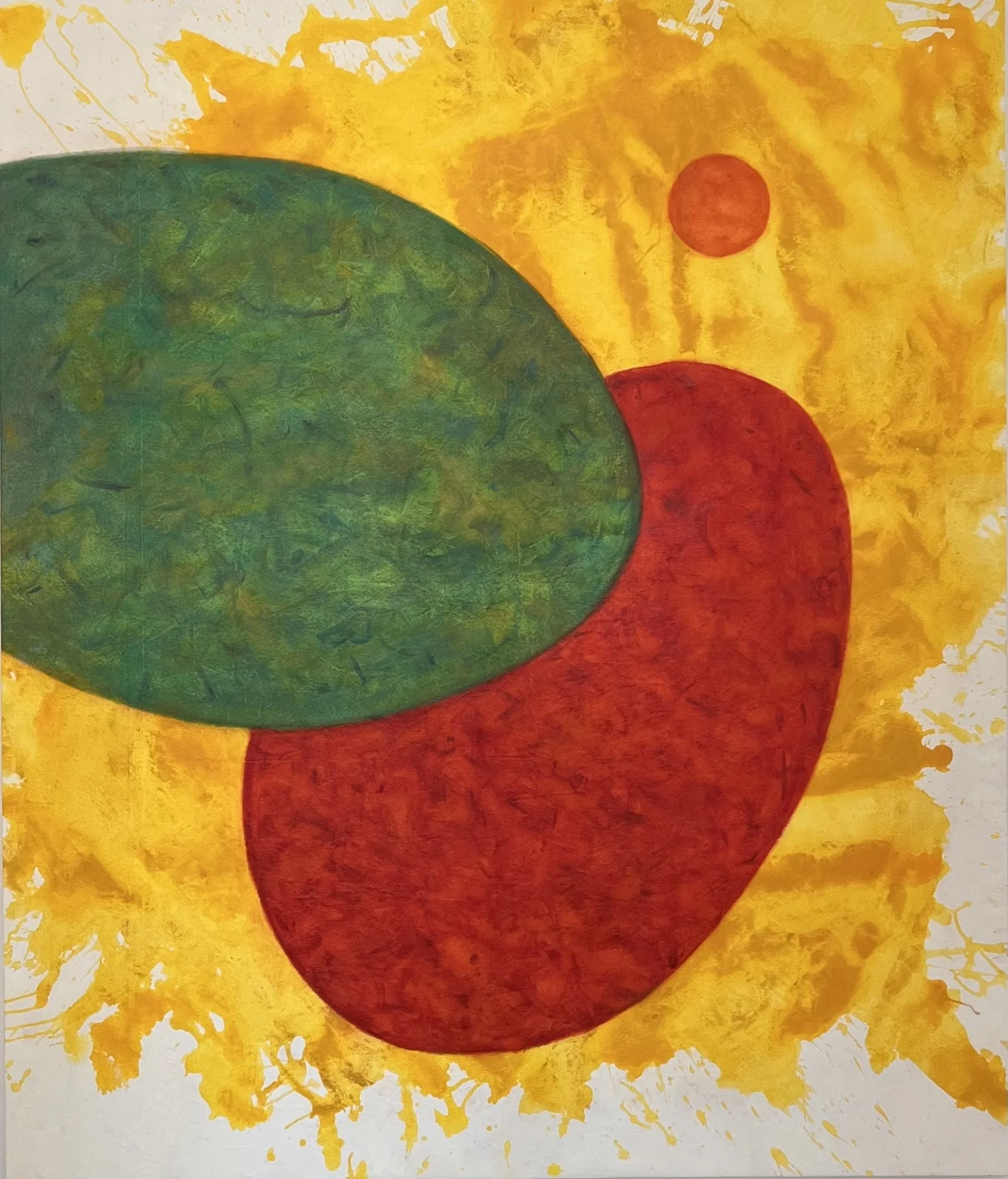
YOLKO 25 (2025–2026) Oil and acrylic on canvas 200 x 168 cm
studio paintings
Functioning as the campaign's relentless supporting assets, these smaller iterations explore how corporate messages are tailored across different media spaces. Some maintain the glossy, manufactured polish of direct visual advertising, whilst others adopt alternative strategies.
In select pieces, such as YOLKO 21 (2025), acrylic is allowed to soak directly into unprimed canvas, retaining a raw, organic vulnerability. This material shift operates much like corporate PR or advertorials, deliberately blurring the lines by dropping the polished ad veneer to project a fabricated sense of authenticity. This material investigation also extends to rigid wooden supports, aligning the work with the banal objects of consumption it critiques.
Across this entire campaign ecosystem, the visual vocabulary integrates graphic disruptions derived from single-use plastic straws. Applied as both diagonal slashes and rigid vertical bars, these linear elements create stark structures of confinement. They hover between the sanitised graphics of consumer packaging and the reality of a prison, visually enacting the banality of evil and the harm inherent in thoughtless consumption. By distilling the composition into these open emblems, the work avoids a didactic narrative, focusing instead on the friction between manufactured aesthetics and systemic fragility.
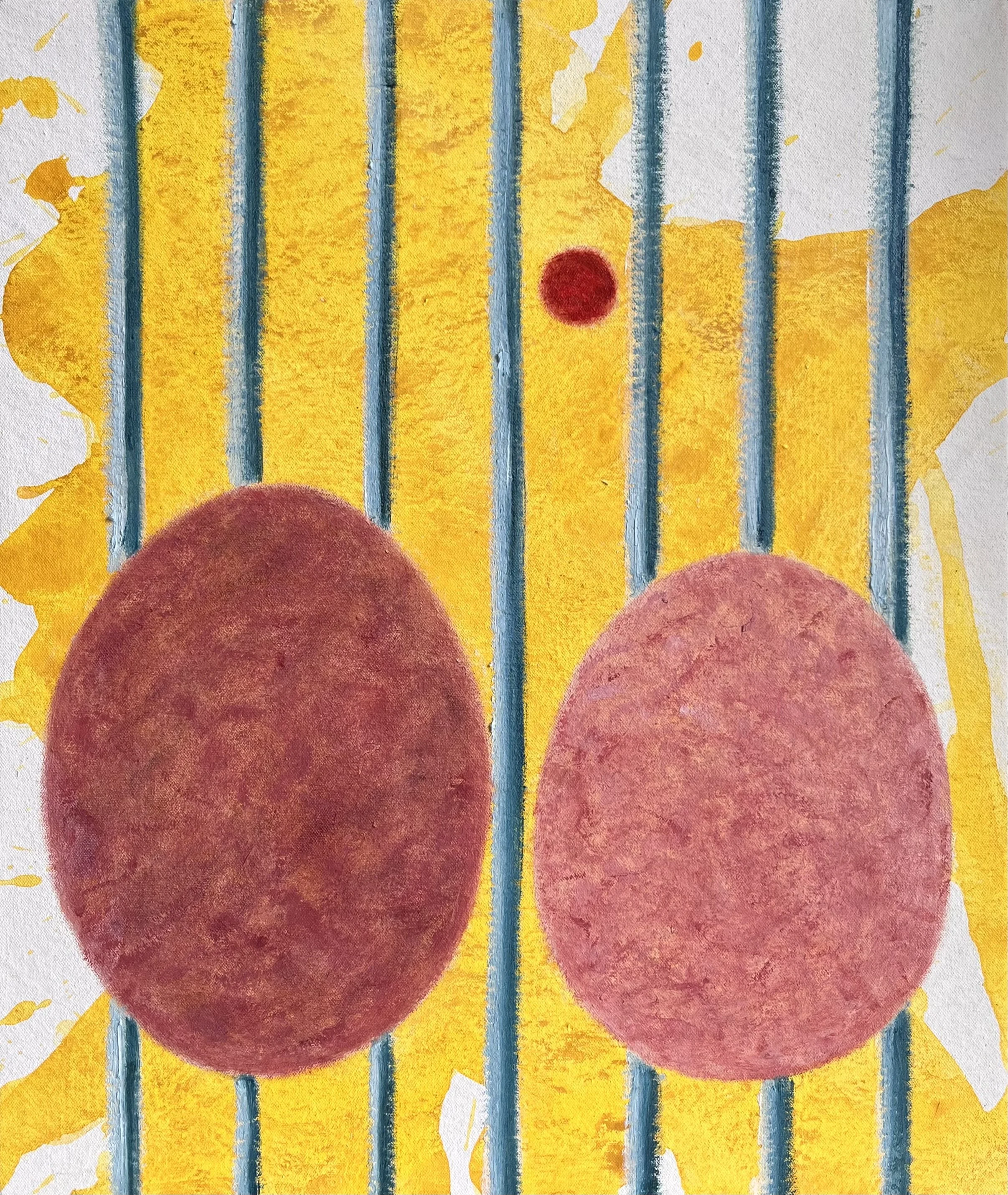
YOLKO 24 (2025-2026) Oil and acrylic on canvas 42 x 35 x 3 cm
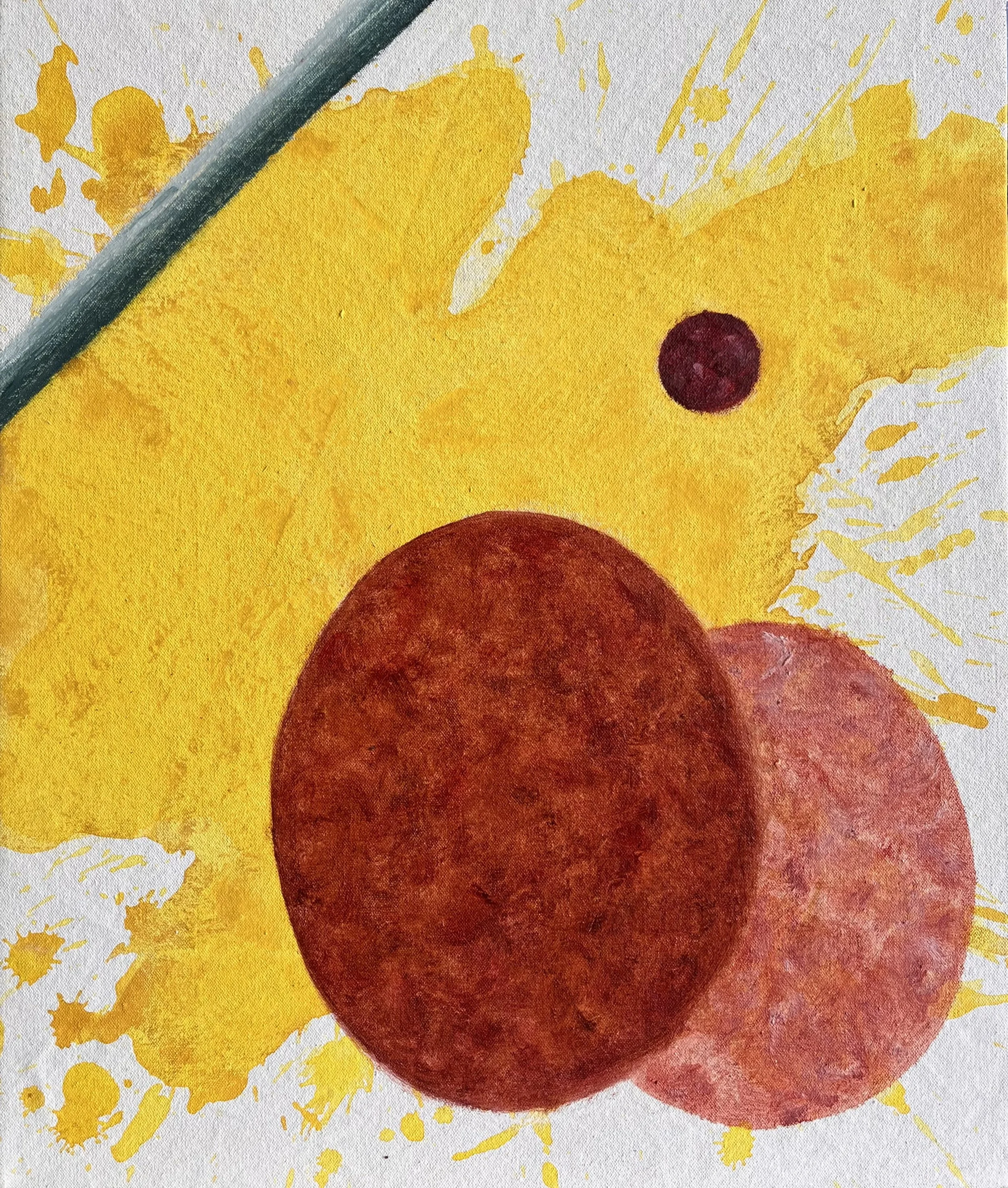
YOLKO 23 (2025-2026) Oil and acrylic on canvas 42 x 35 x 3 cm
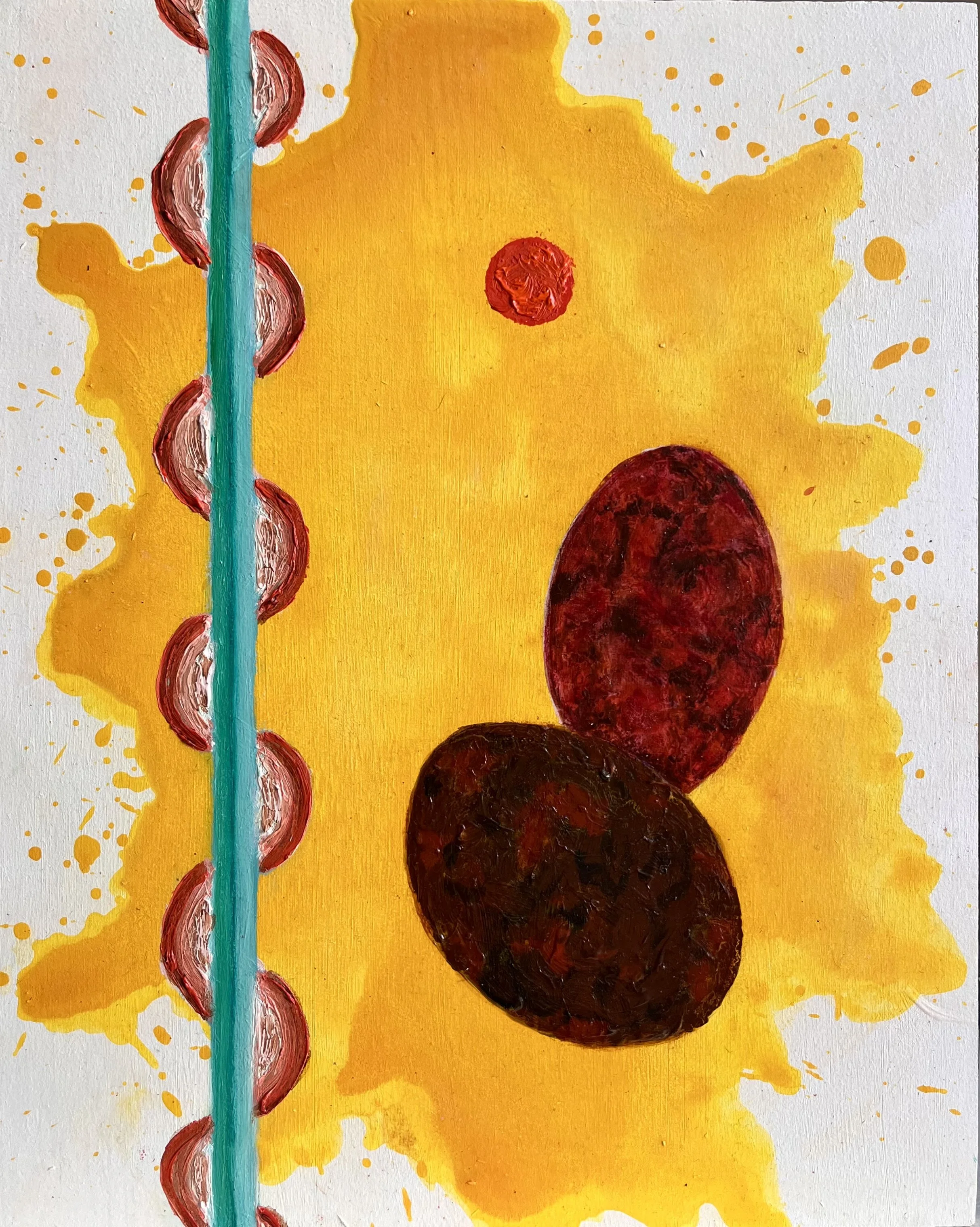
YOLKO 22 (2026) Oil and acrylic on wood 30 x 24 cm
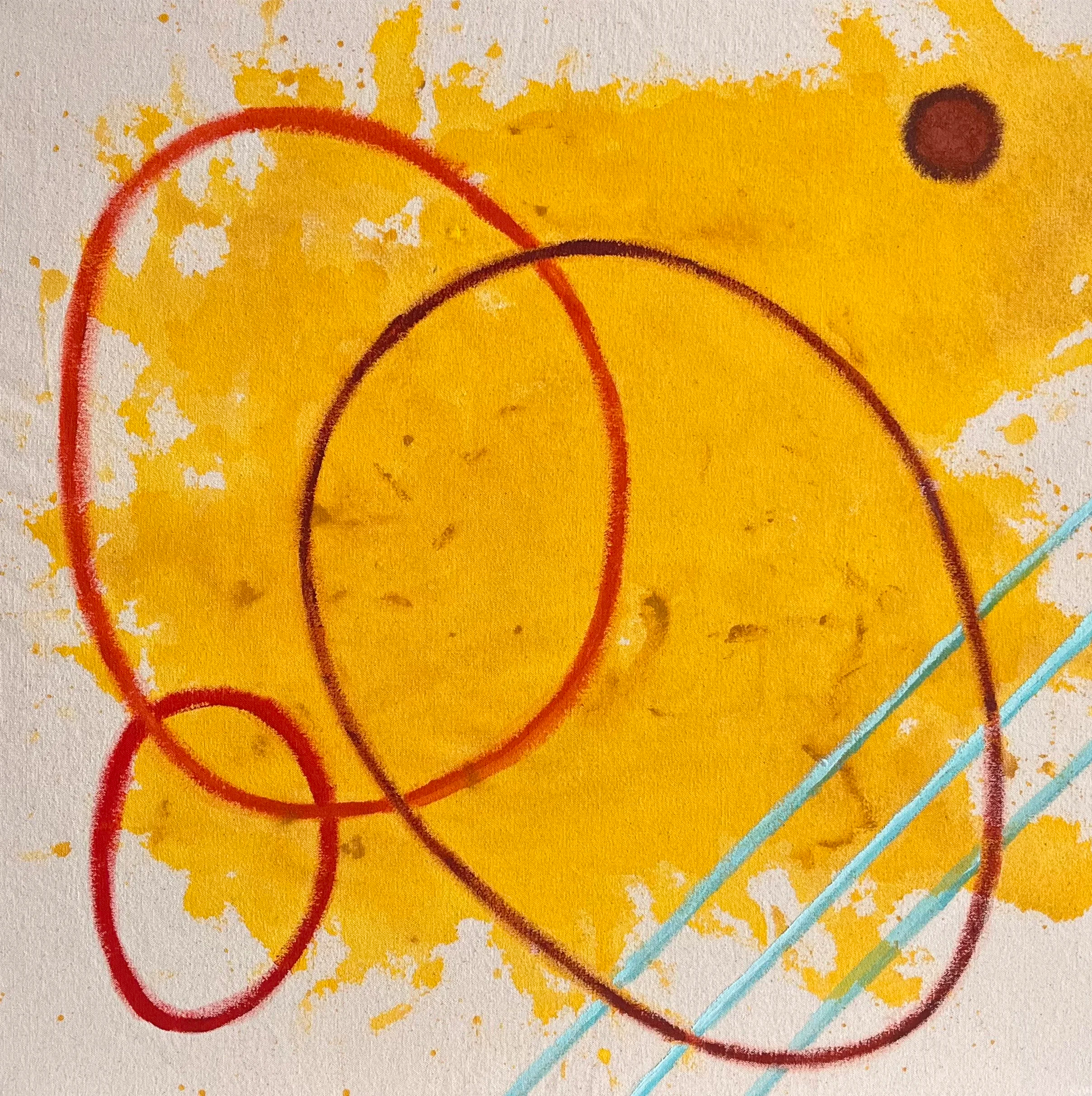
YOLKO 21 (2025-2026) Acrylic on unprimed canvas 55 × 55 x 3 cm
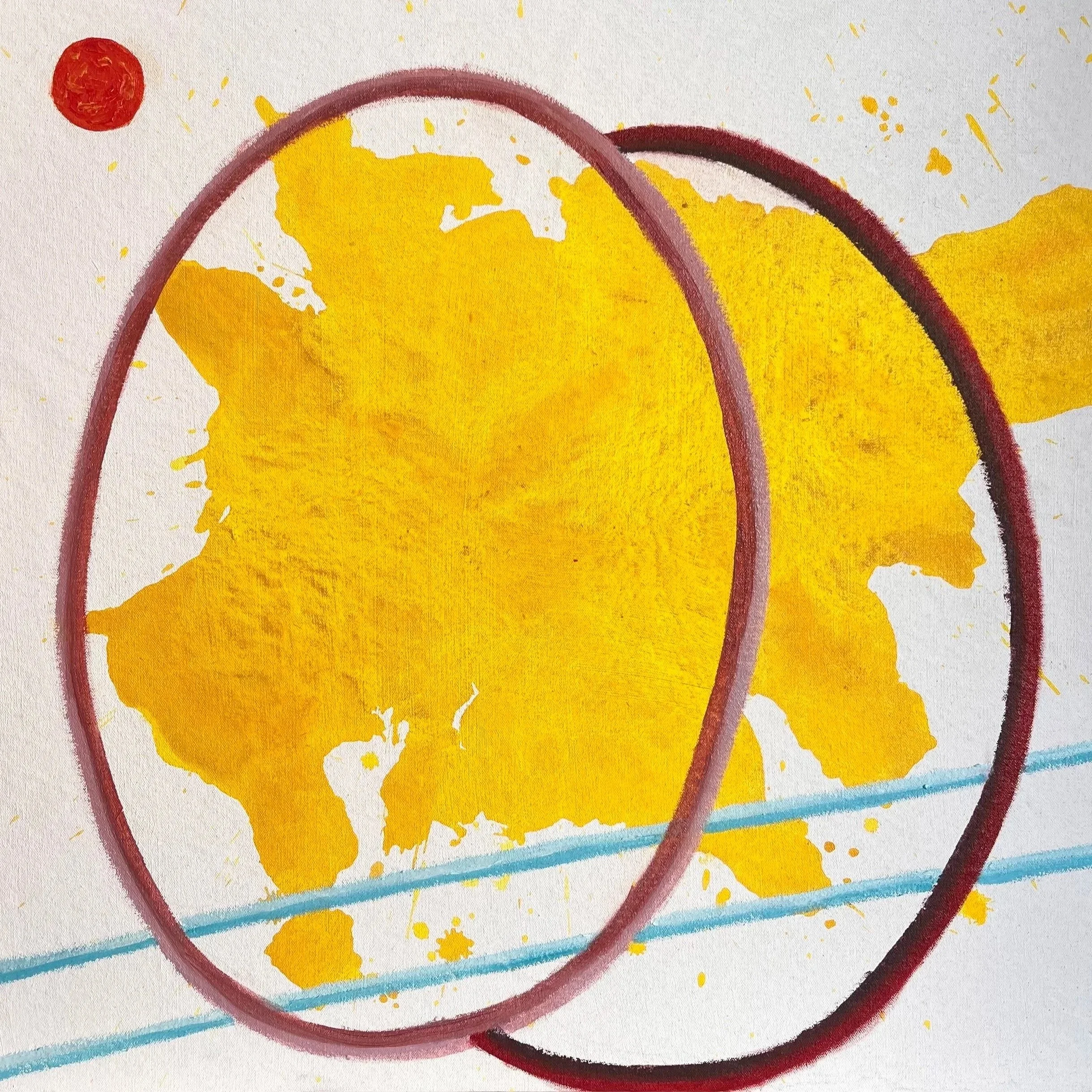
YOLKO 20 (2025-2026) Oil and acrylic on canvas 50 × 50 x 3 cm
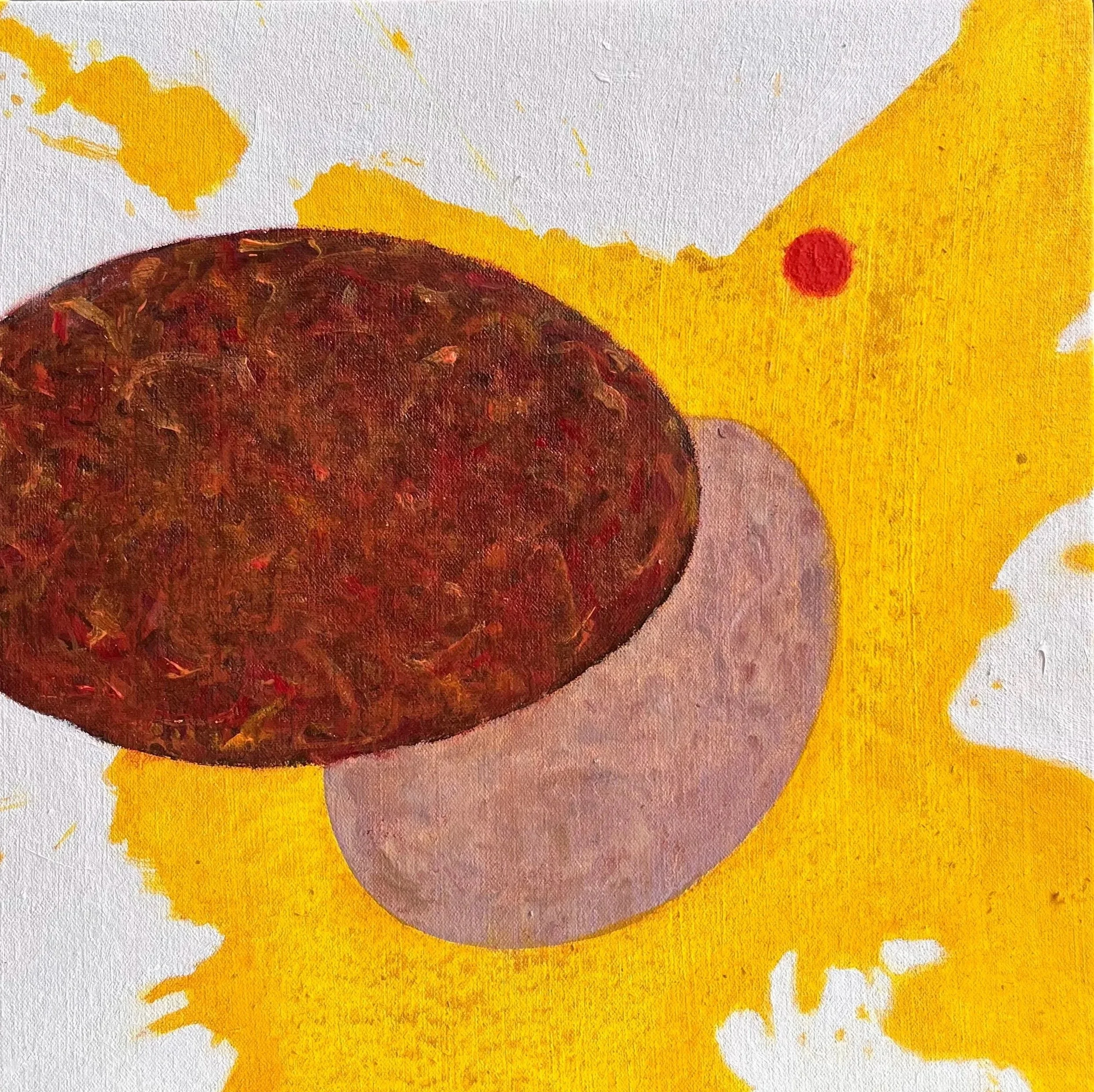
YOLKO 19 (2025-2026) Oil and acrylic on canvas 30 × 30 x 3 cm
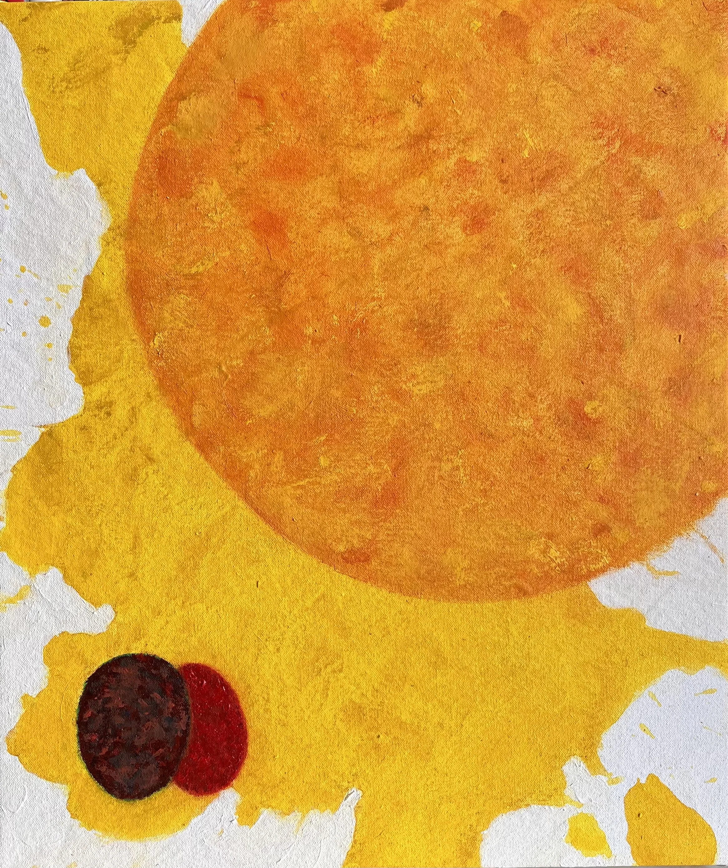
YOLKO 18 (2025-2026) Oil and acrylic on canvas 42 x 35 x 3 cm
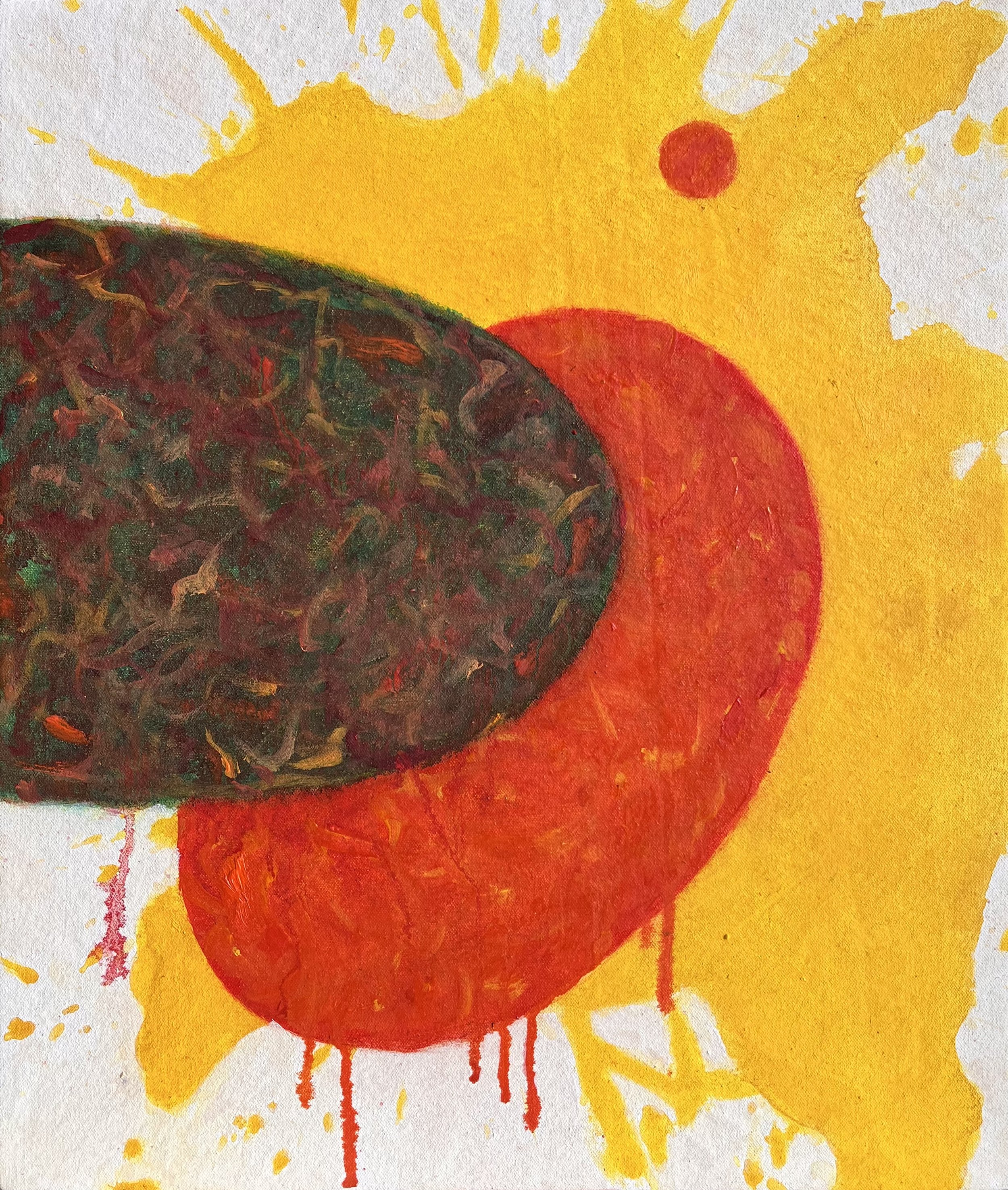
YOLKO 17 (2025-2026) Oil and acrylic on canvas 42 x 35 x 3 cm
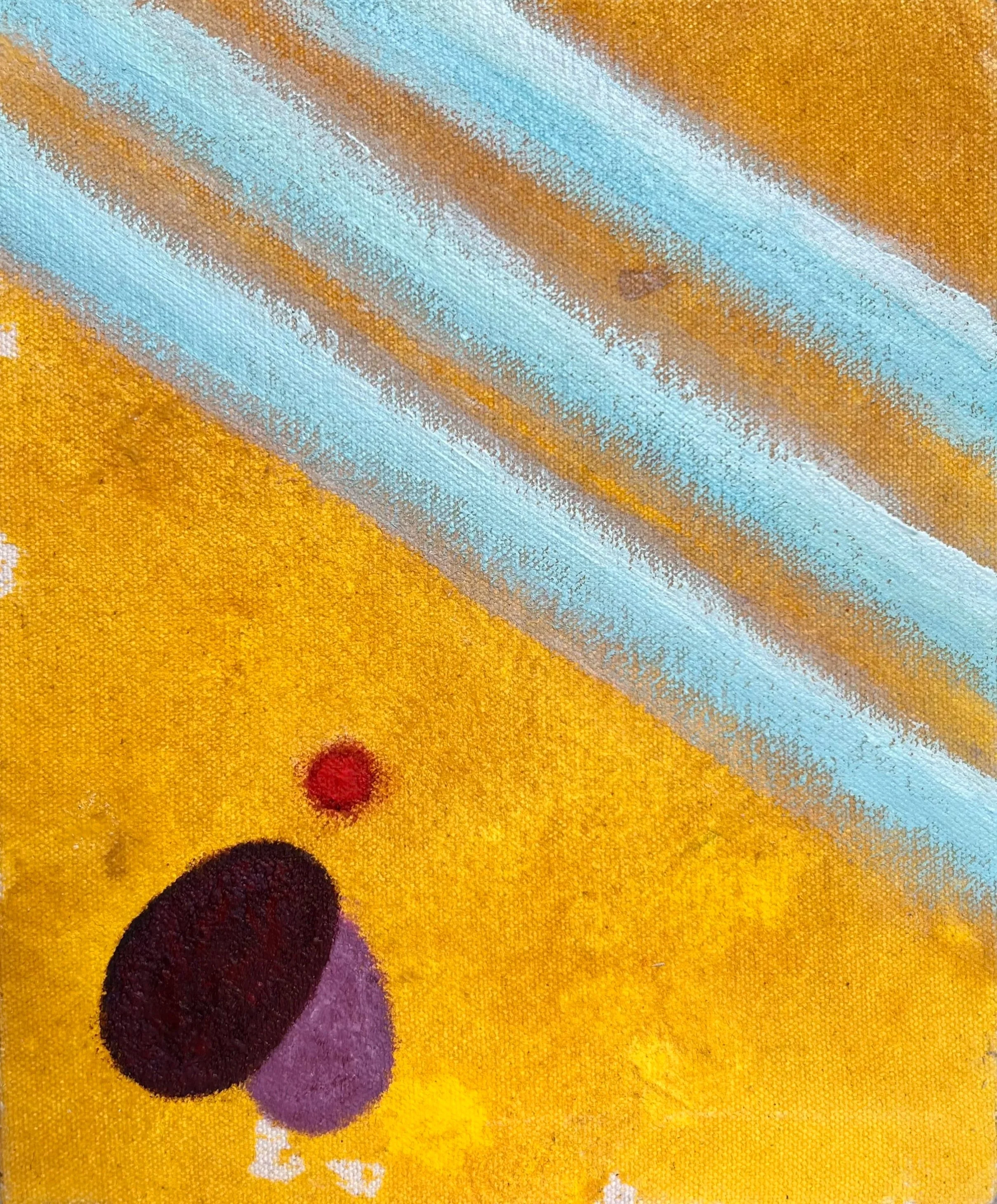
YOLKO 16 (2025-2026) Acrylic on unprimed canvas 18 × 15 x 4 cm
mixed media on canvas
Bridging the studio and the print room, these works are constructed through a multi-layered physical process. The canvases begin with initial applications of paint before a monotype layer is applied; they then return to the studio for final hand-applied interventions in oil and acrylic. This sequence examines how the flat, printed surface of commercial branding interacts with the tactile reality of paint.
A physical tension emerges between the mechanical printed elements and the heavier, textured painted forms. The visual vocabulary here introduces architectural elements based on commercial egg cartons, which operate as rigid grids or cages. This interplay between the cheerful palette of consumer packaging and the physical weight of the materials examines the structures of confinement inherent in industrial systems.
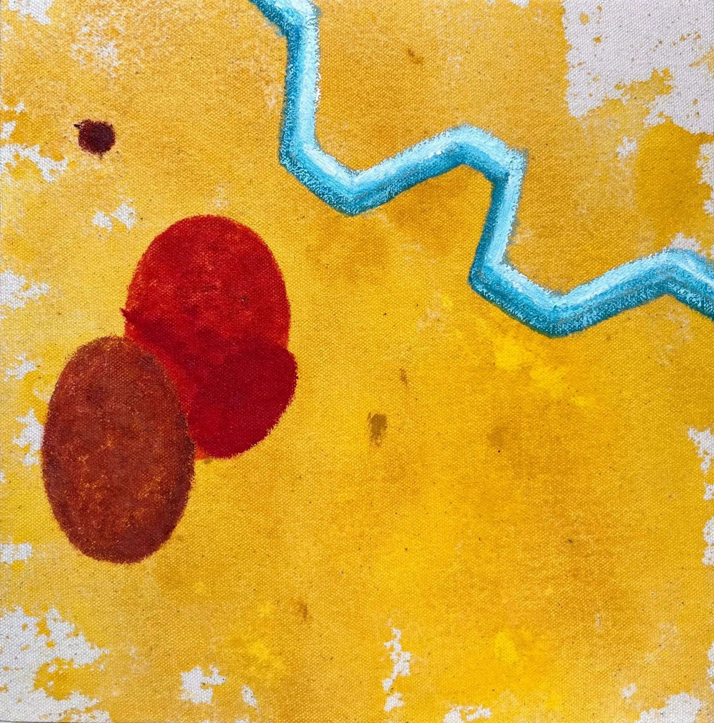
YOLKO 15 (2025-2026) Monotype and acrylic on unprimed canvas 20 × 20 x 4 cm
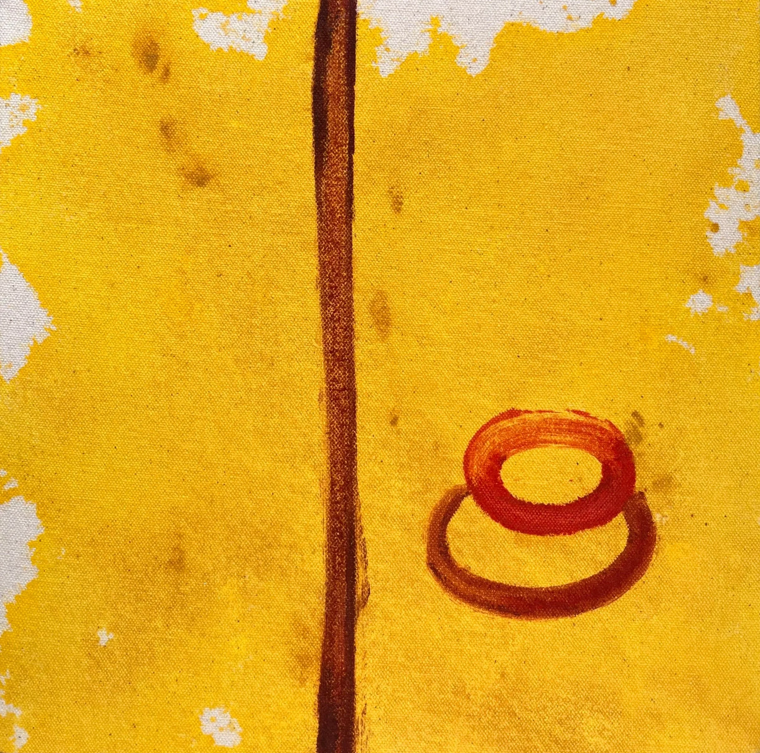
YOLKO 14 (2025-2026) Monotype and acrylic on unprimed canvas 20 × 20 x 4cm
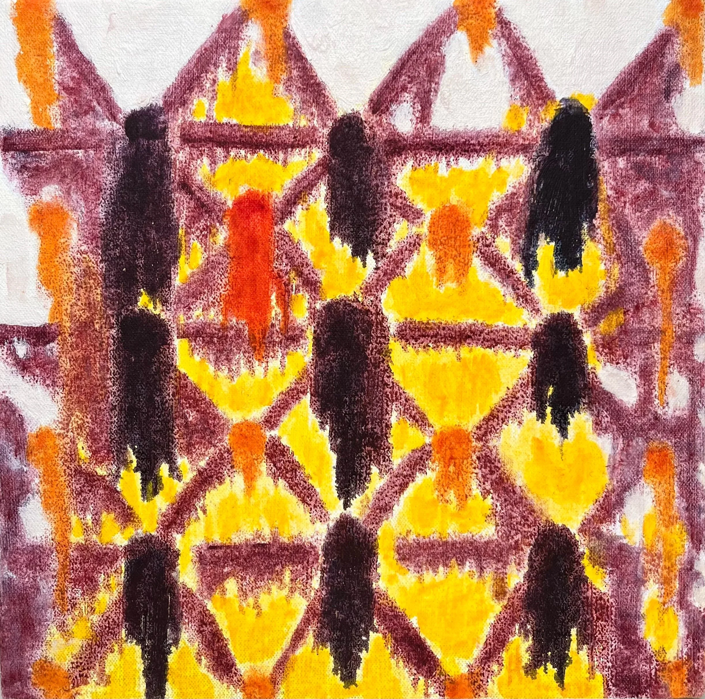
YOLKO 13 (2025-2026) Monotype, oil, and acrylic on canvas 20 × 20 x 4 cm
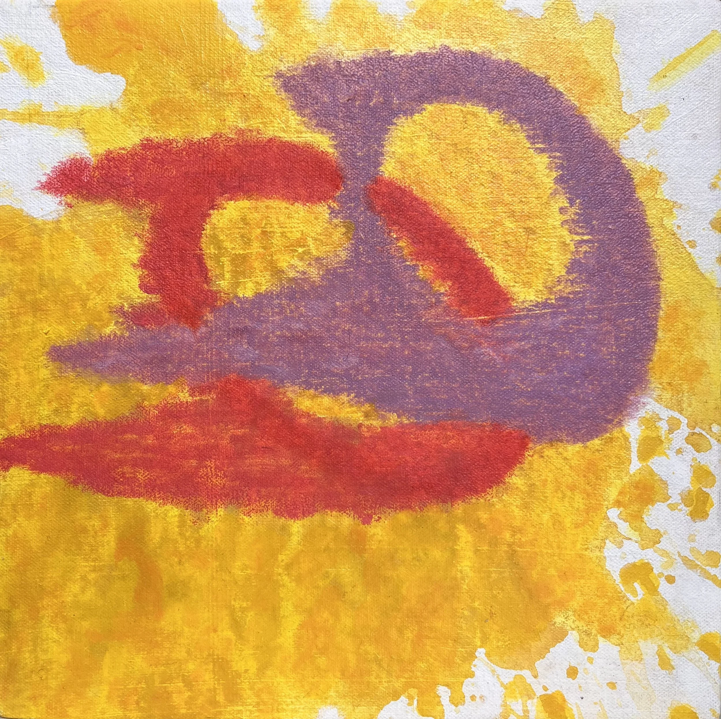
YOLKO 12 (2025-2026) Monotype, oil, and acrylic on canvas 20 × 20 x 4 cm
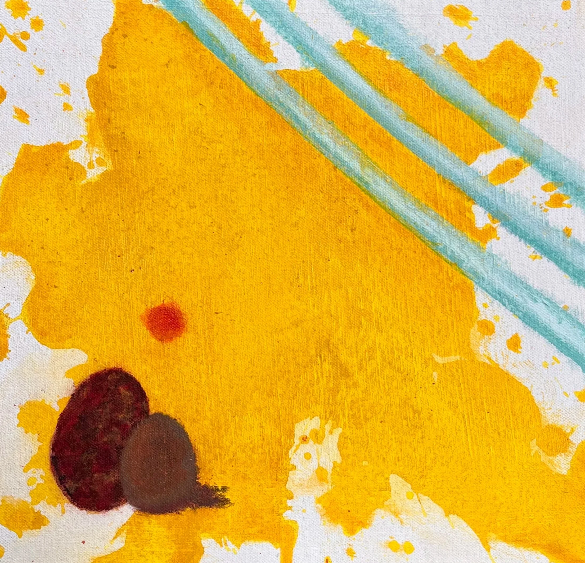
YOLKO 11 (2025-2026) Monotype, oil, and acrylic on canvas 20 × 20 x 4 cm
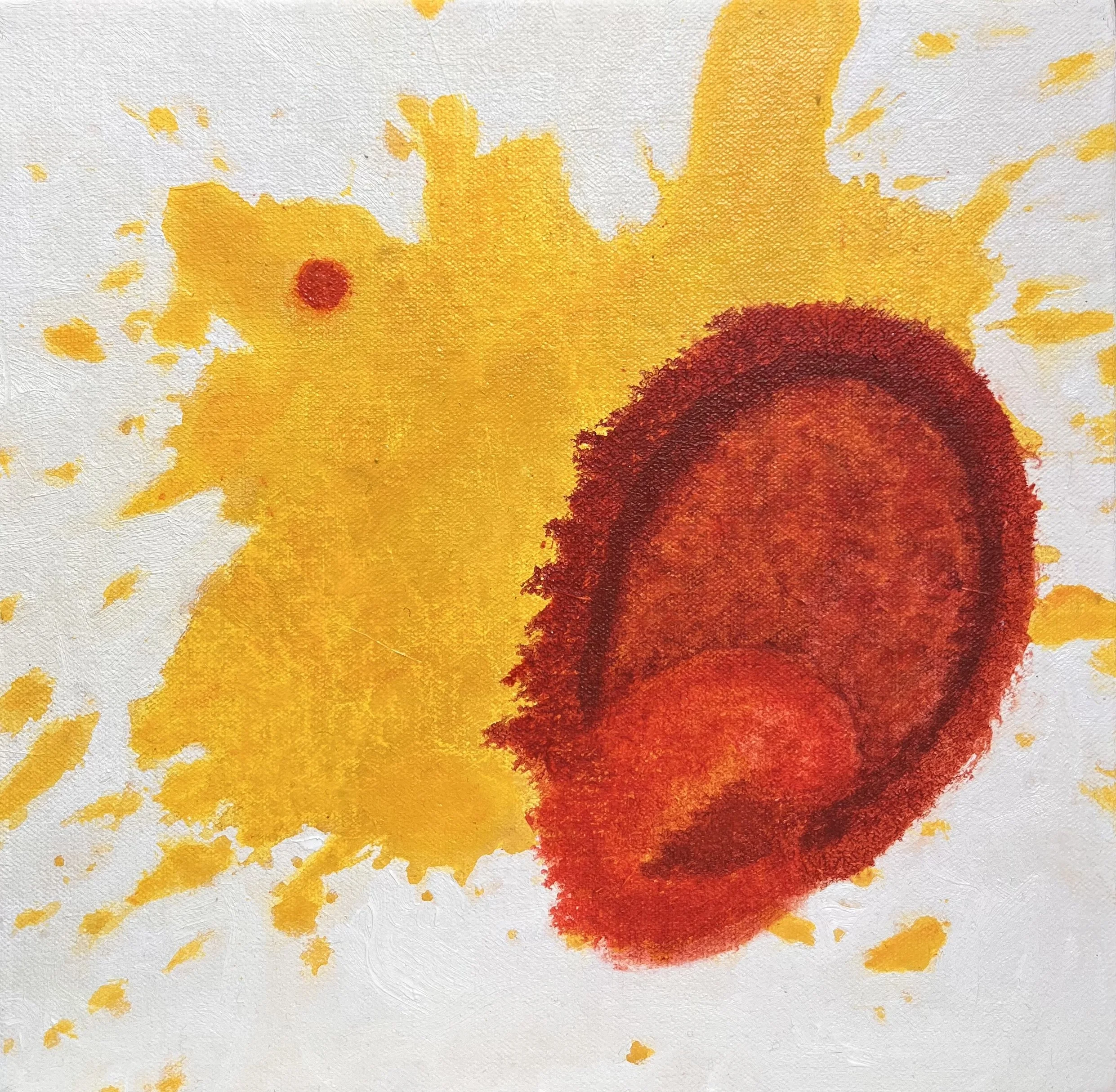
YOLKO 10 (2025-2026) Monotype, oil, and acrylic on canvas 20 × 20 x 4 cm
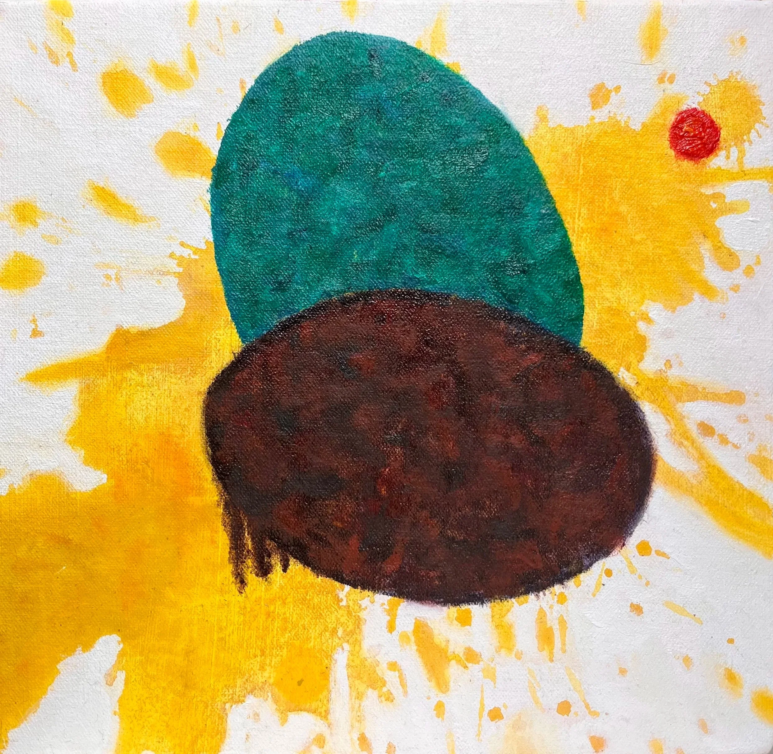
YOLKO 9 (2025-2026) Monotype, oil, and acrylic on canvas 20 × 20 x 4 cm
monotypes
The monotype process examines the intersection of human agency and industrialised systems. Each print involves a dual process: the initial hand-painted layer preserves the physical trace of individual intervention, while the subsequent force of the mechanical press evokes the standardising effects of mass production. This method ensures each print remains a unique object, even as it is generated through a mechanised system, highlighting the tension between the organic subject and the industrial conveyor belt.
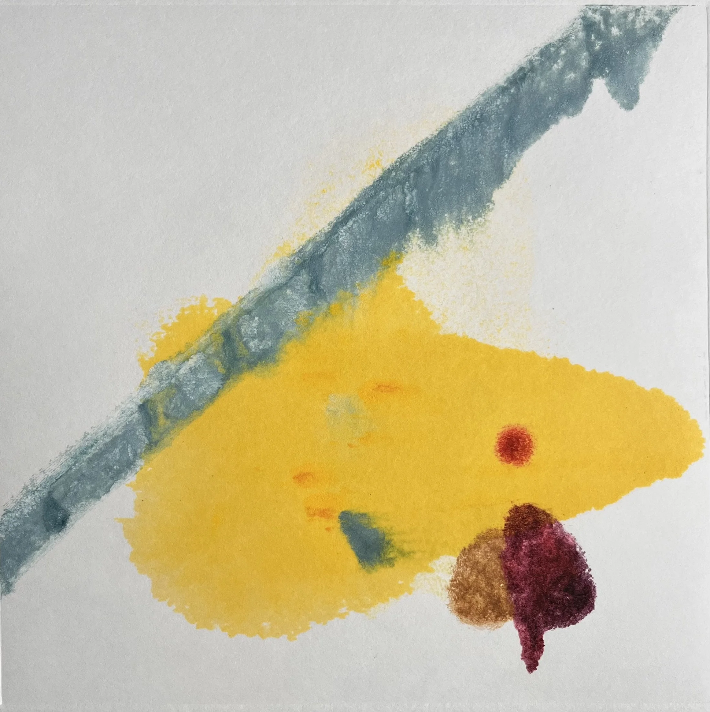
YOLKO 8 (2025) Monotype on paper 20.5 × 20.5 cm
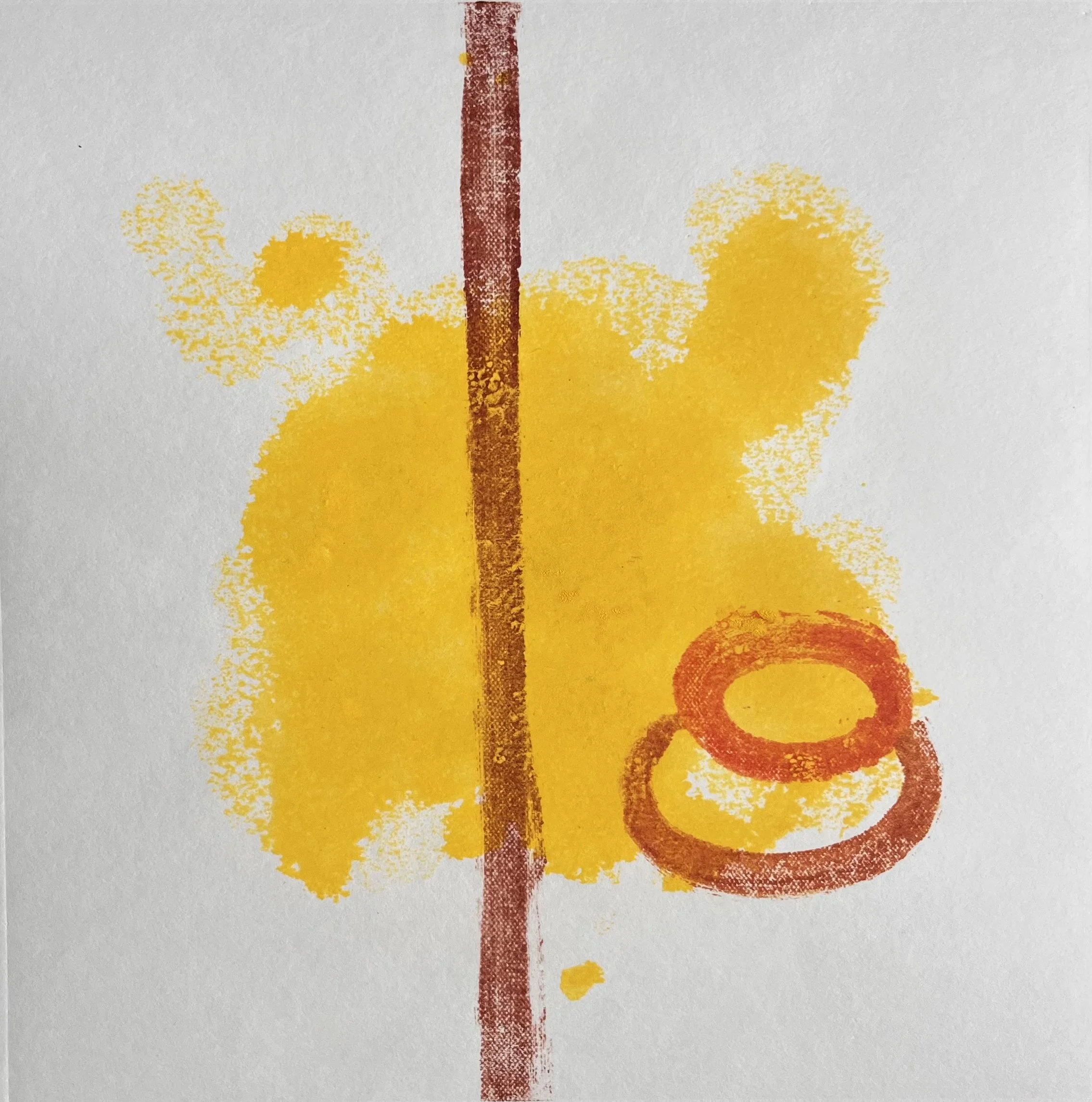
YOLKO 7 (2025) Monotype on paper 20.5 × 20.5 cm
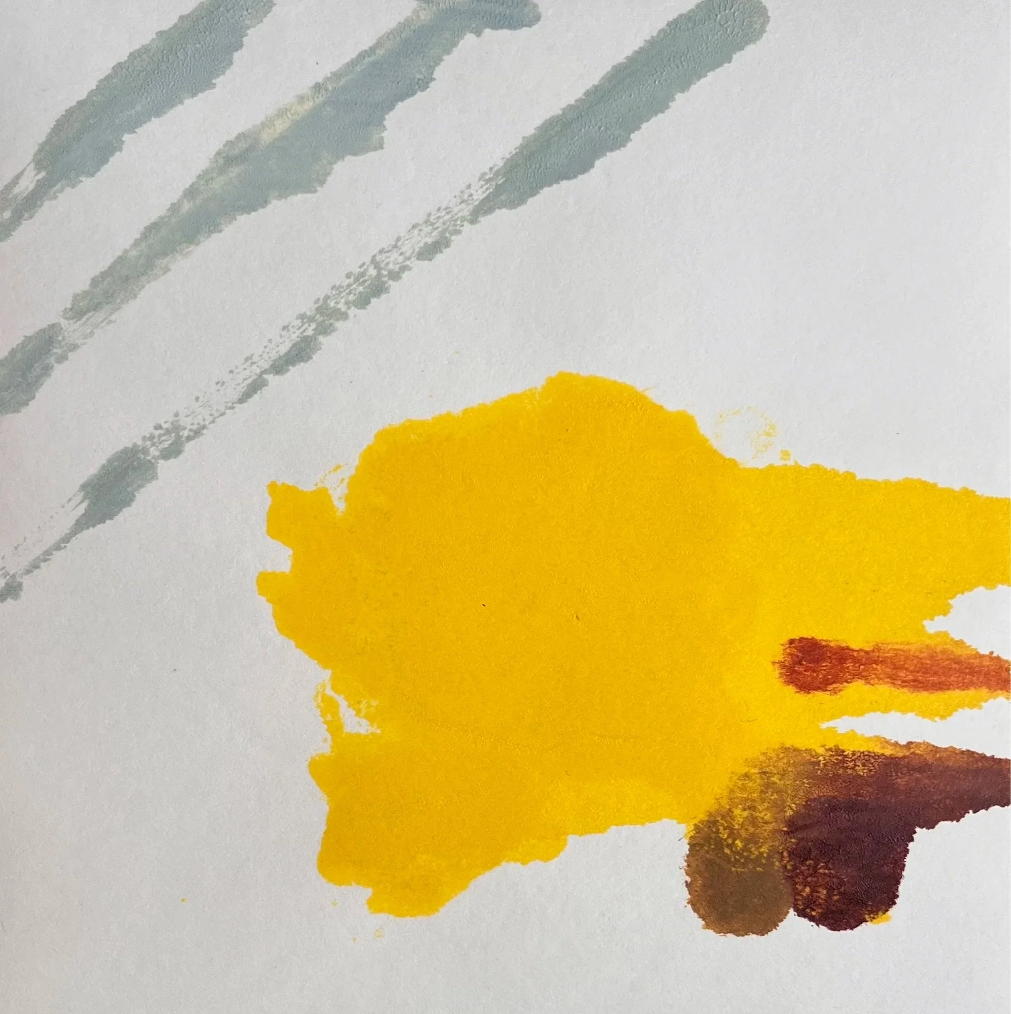
YOLKO 6 (2025) Monotype on paper 20.5 × 20.5 cm
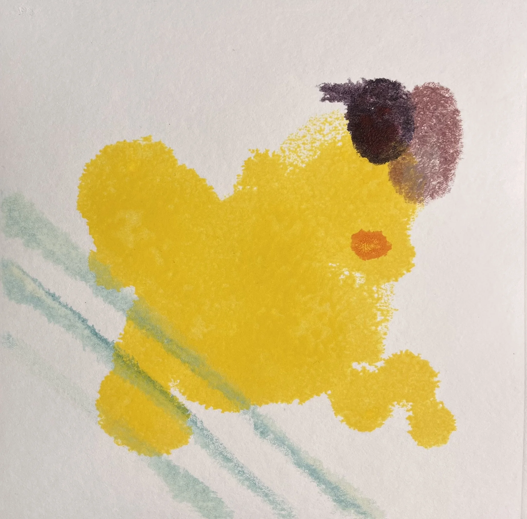
YOLKO 5 (2025) Monotype on paper 20.5 × 20.5 cm
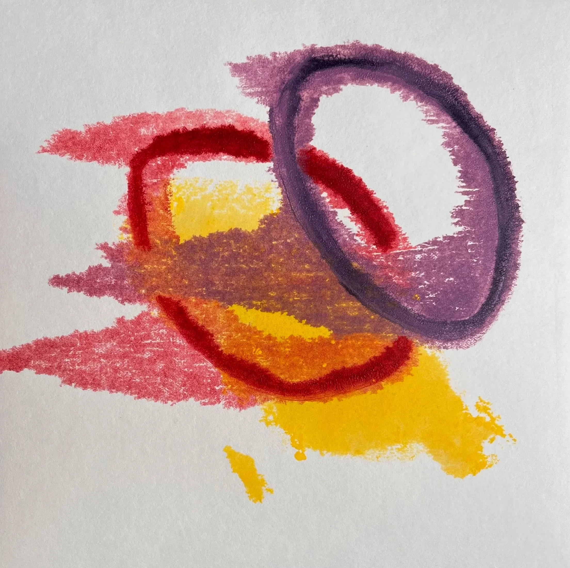
YOLKO 4 (2025) Monotype on paper 20.5 × 20.5 cm
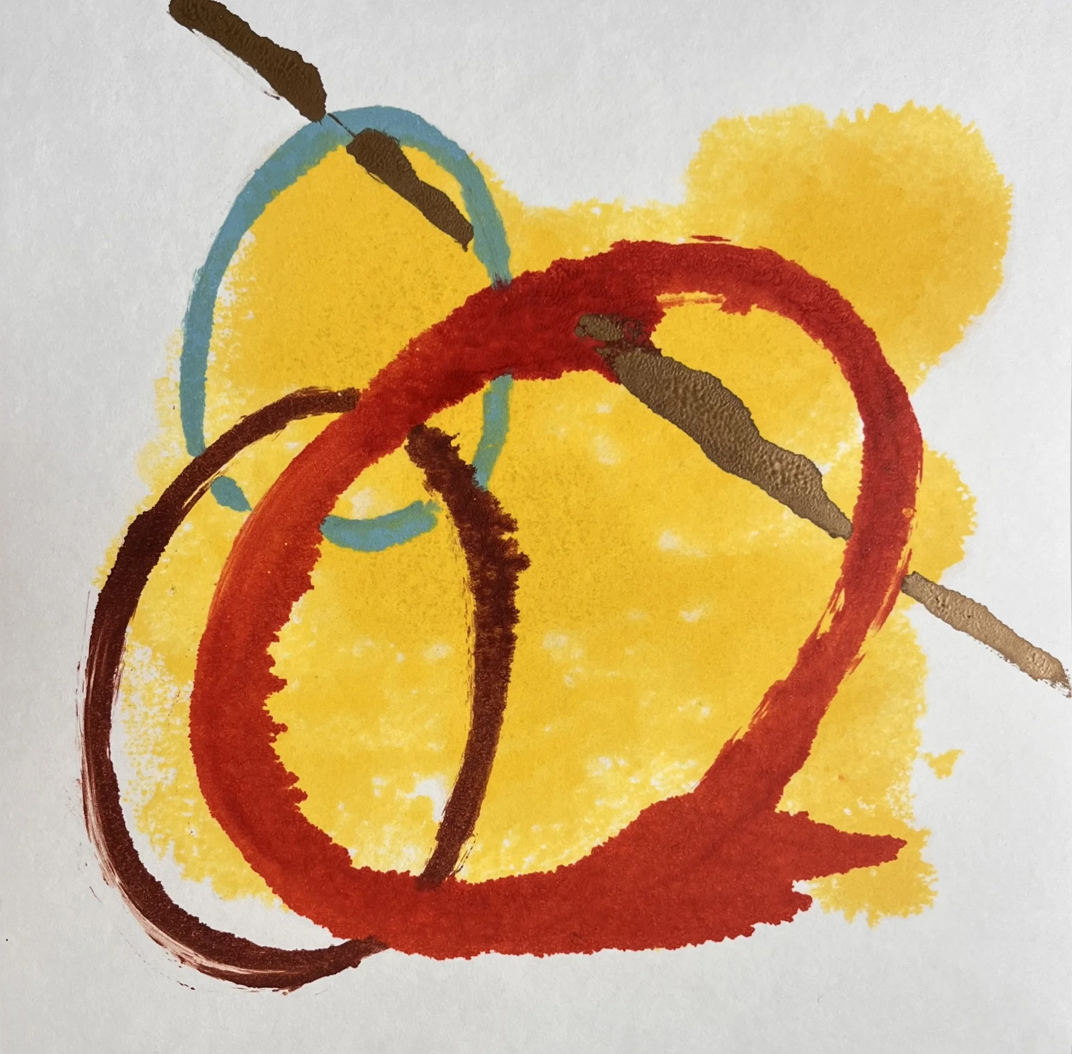
YOLKO 3 (2025) Monotype on paper 20.5 × 20.5 cm
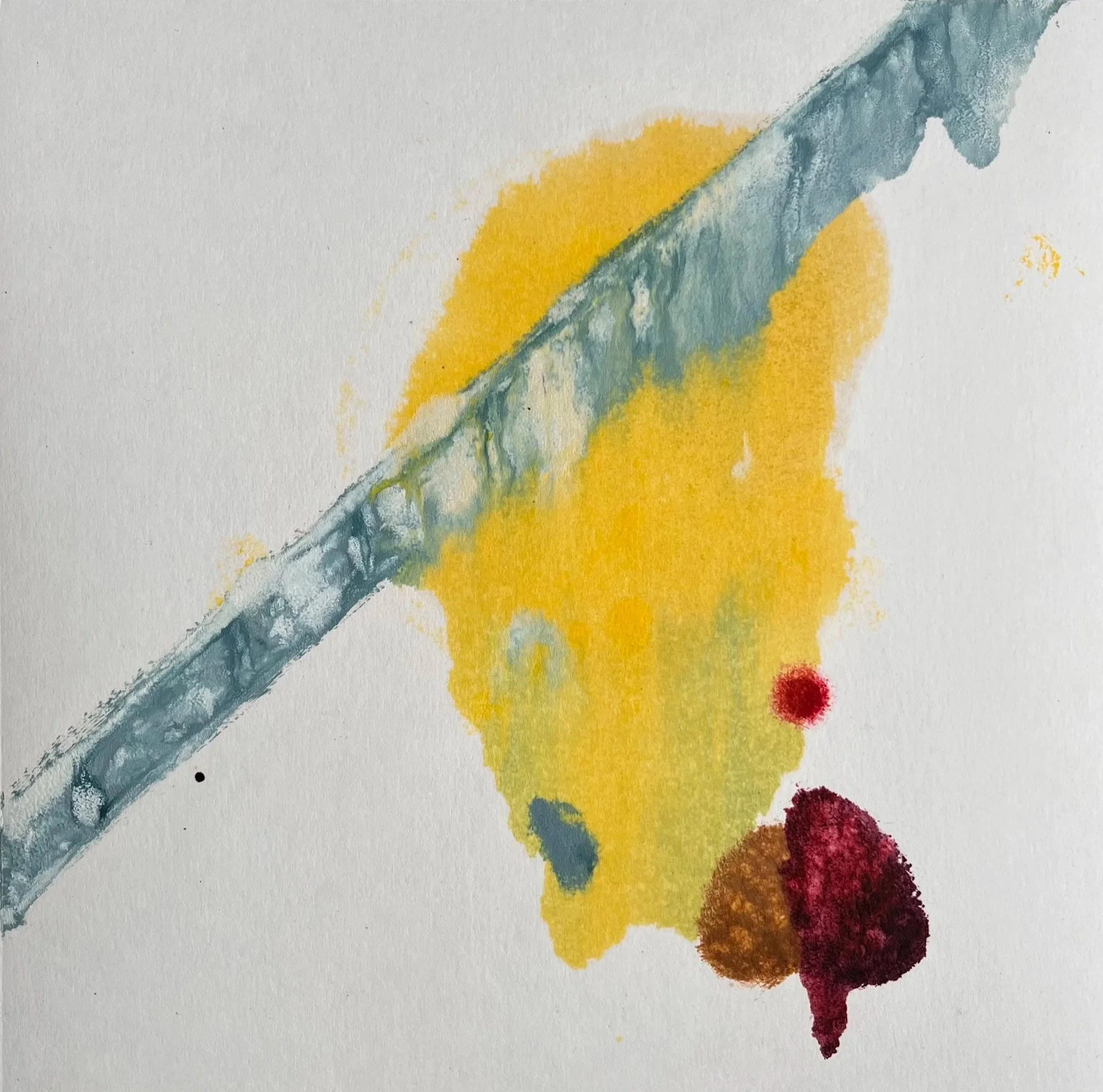
YOLKO 2 (2025) Monotype on paper 20.5 × 20.5 cm
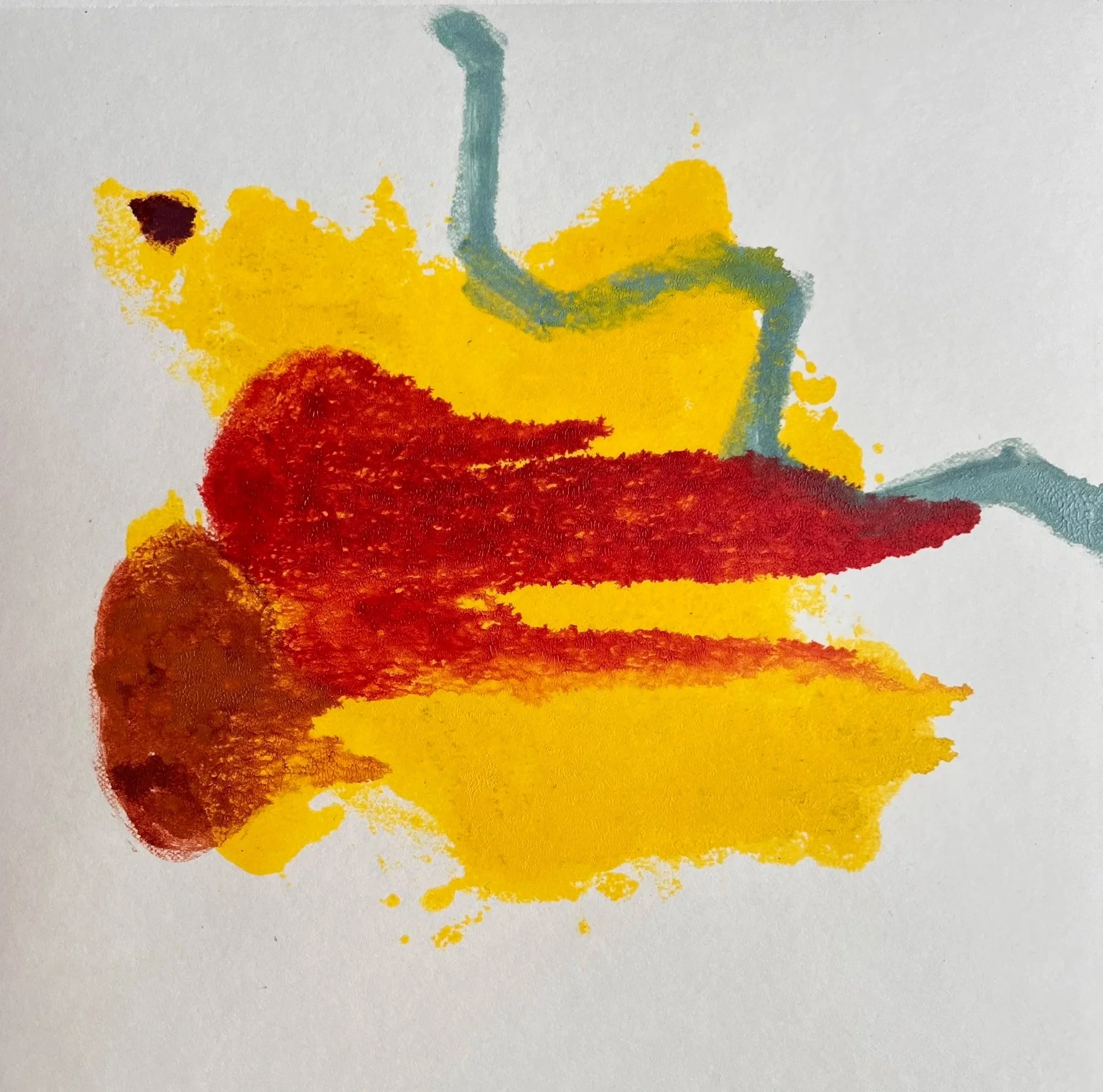
YOLKO 1 (2025) Monotype on paper 20.5 × 20.5 cm